SwimzSkinz Branding
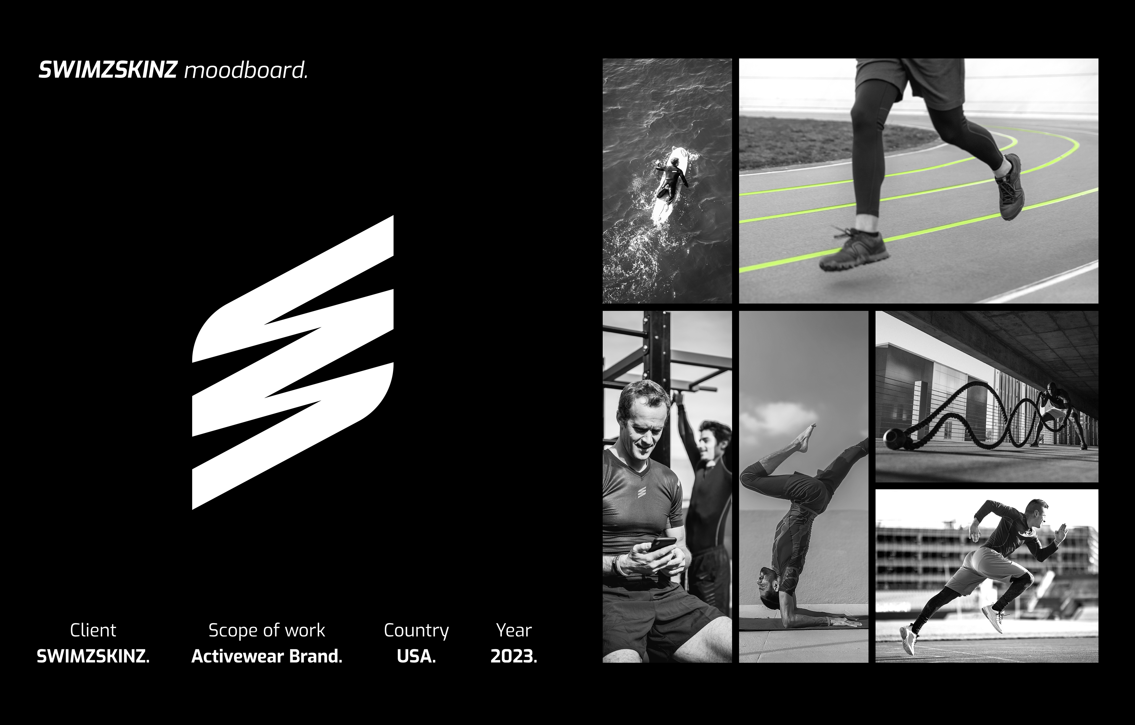
SwimzSkinz is an American activewear brand built for athletes.
The personality was easy to describe. Bold. Flexible. Full of energy.
The hard part was translating those three words into a visual identity that sticks in the audience's mind.
Here's how we did it.
The Logo
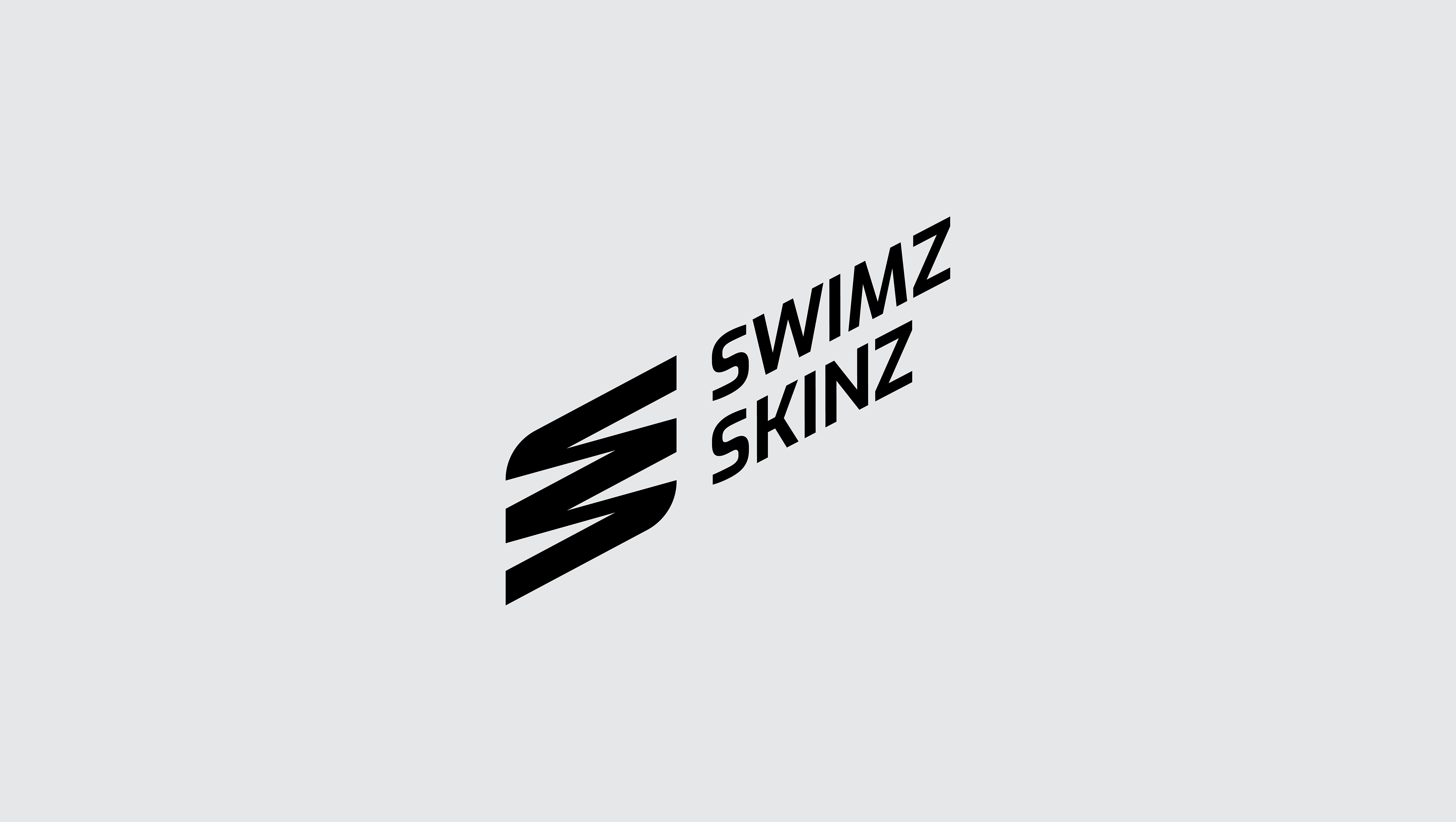
A long name is usually a branding problem. For SwimzSkinz, it became an opportunity.
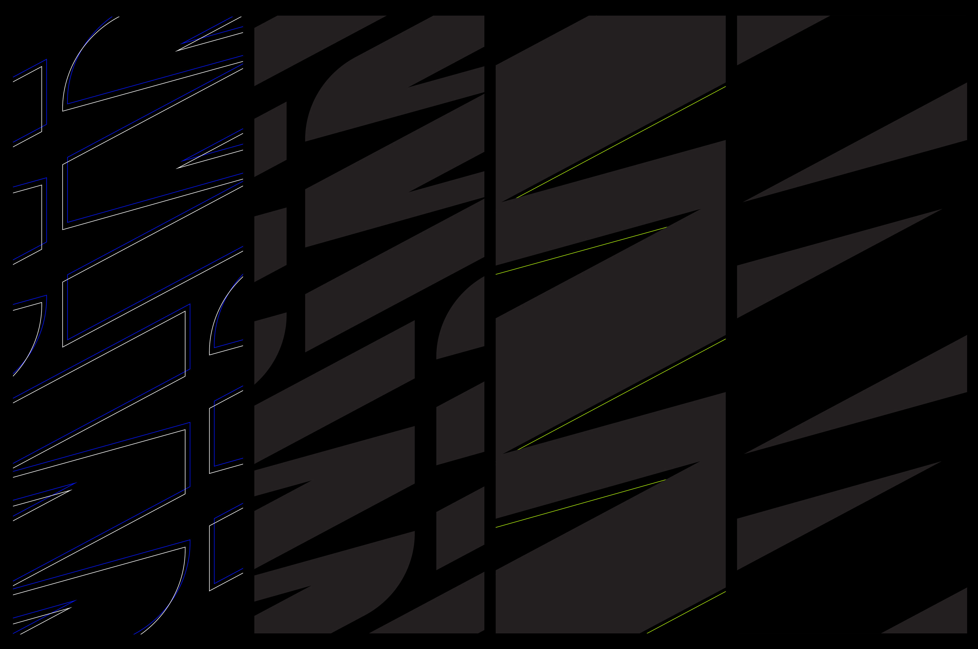
The name has two standout letters—S and Z—so we built the logo around them.
We combined them in a thoughtful way to express flexibility and continuity.
The italic angle adds dynamism and energy, while the sharp edges convey boldness.
The personality isn't described. It's seen.

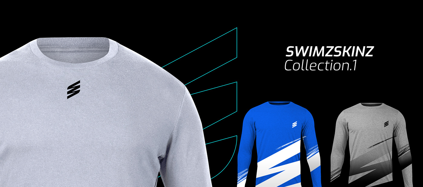
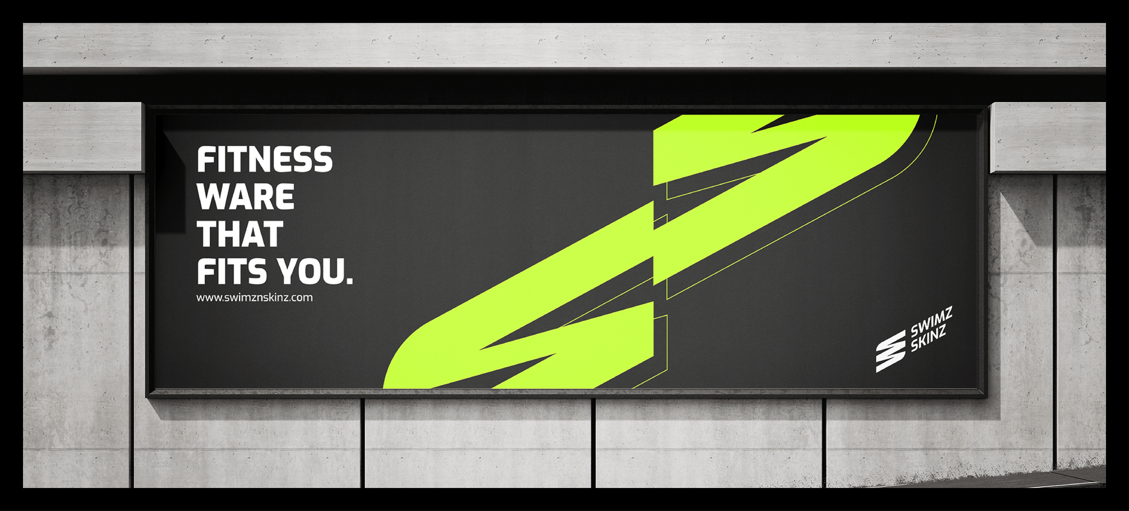
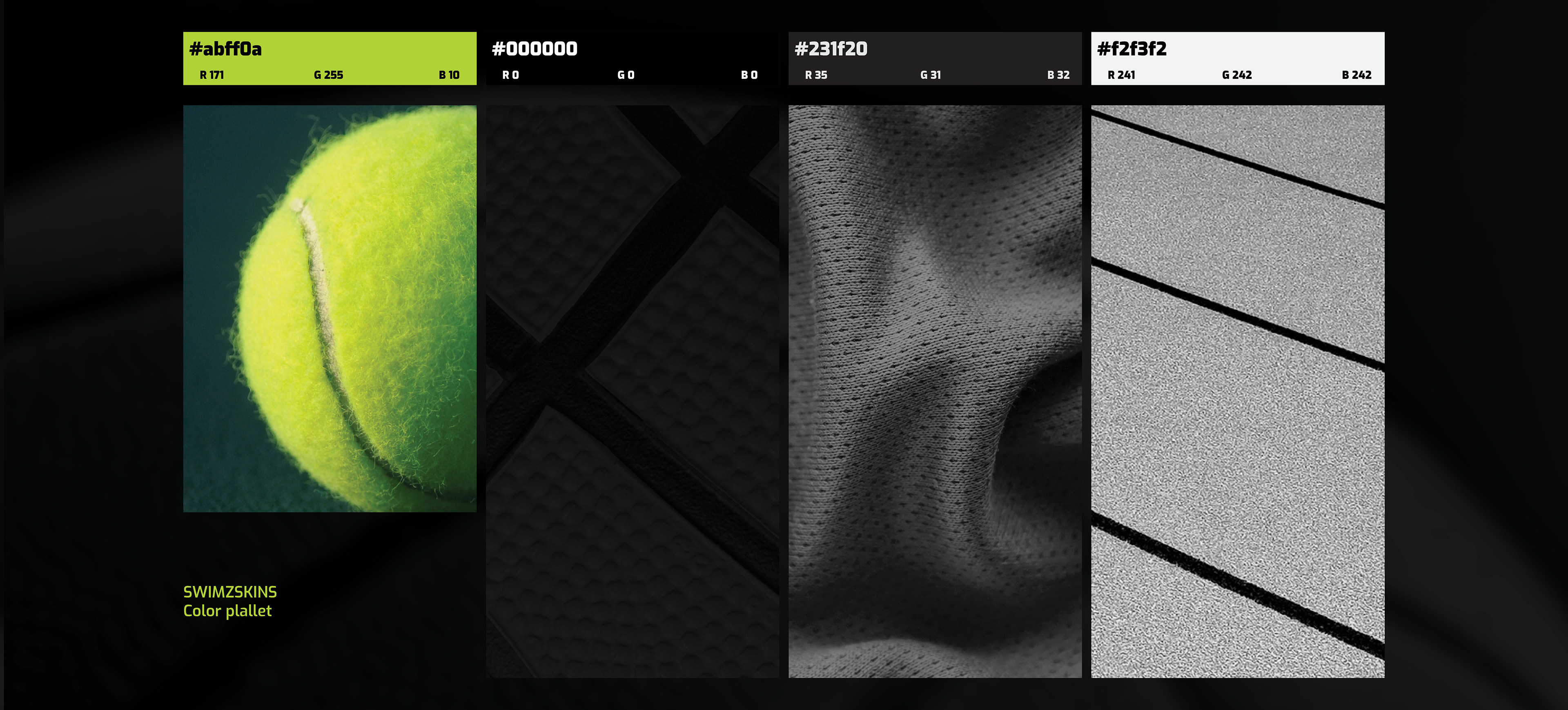
Black & White Colors
Activewear comes in all colors, so black and white were chosen as primary brand colors to seamlessly match any shade.
Green is used as a secondary color to add a vibrant touch to original pieces and online presence.
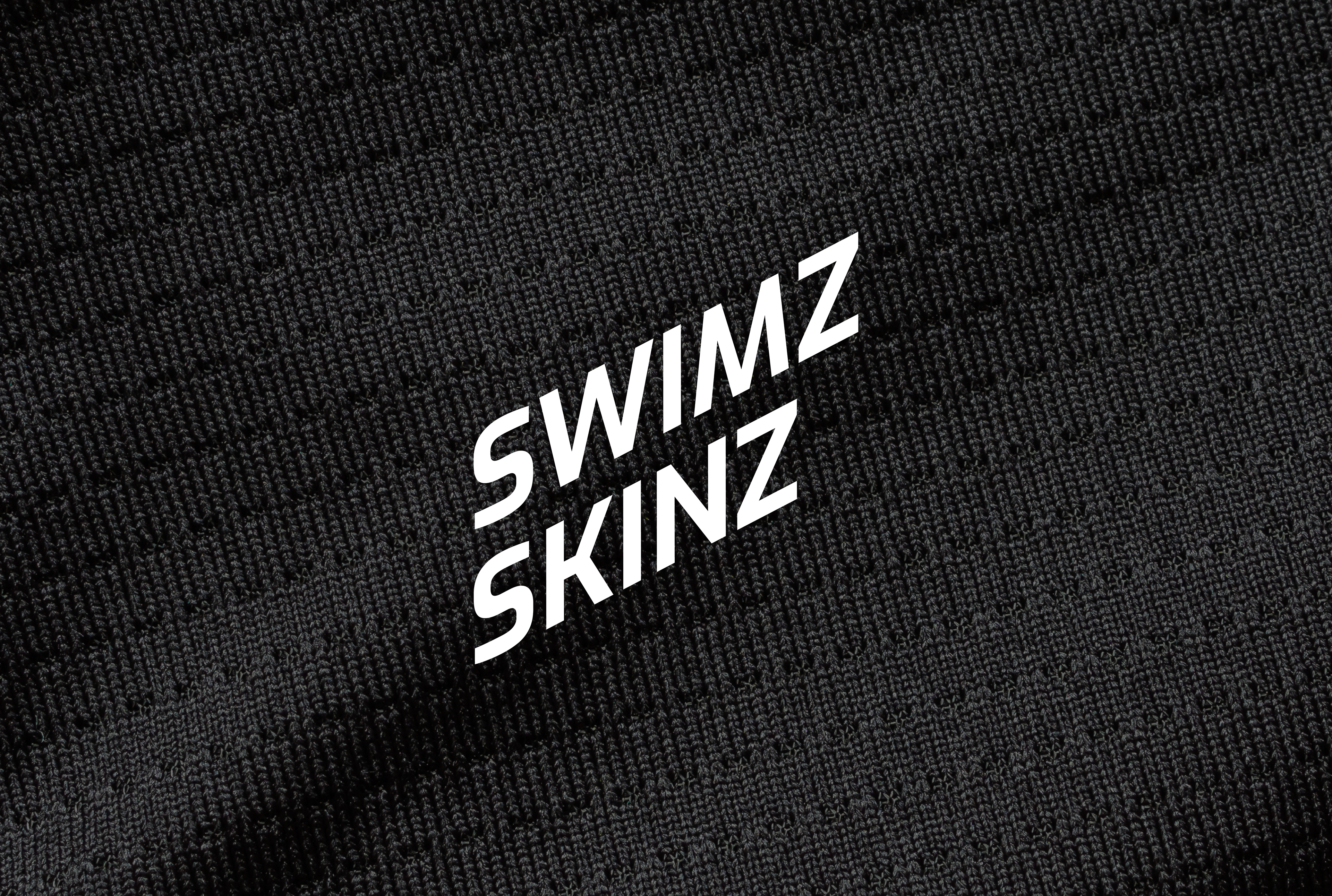
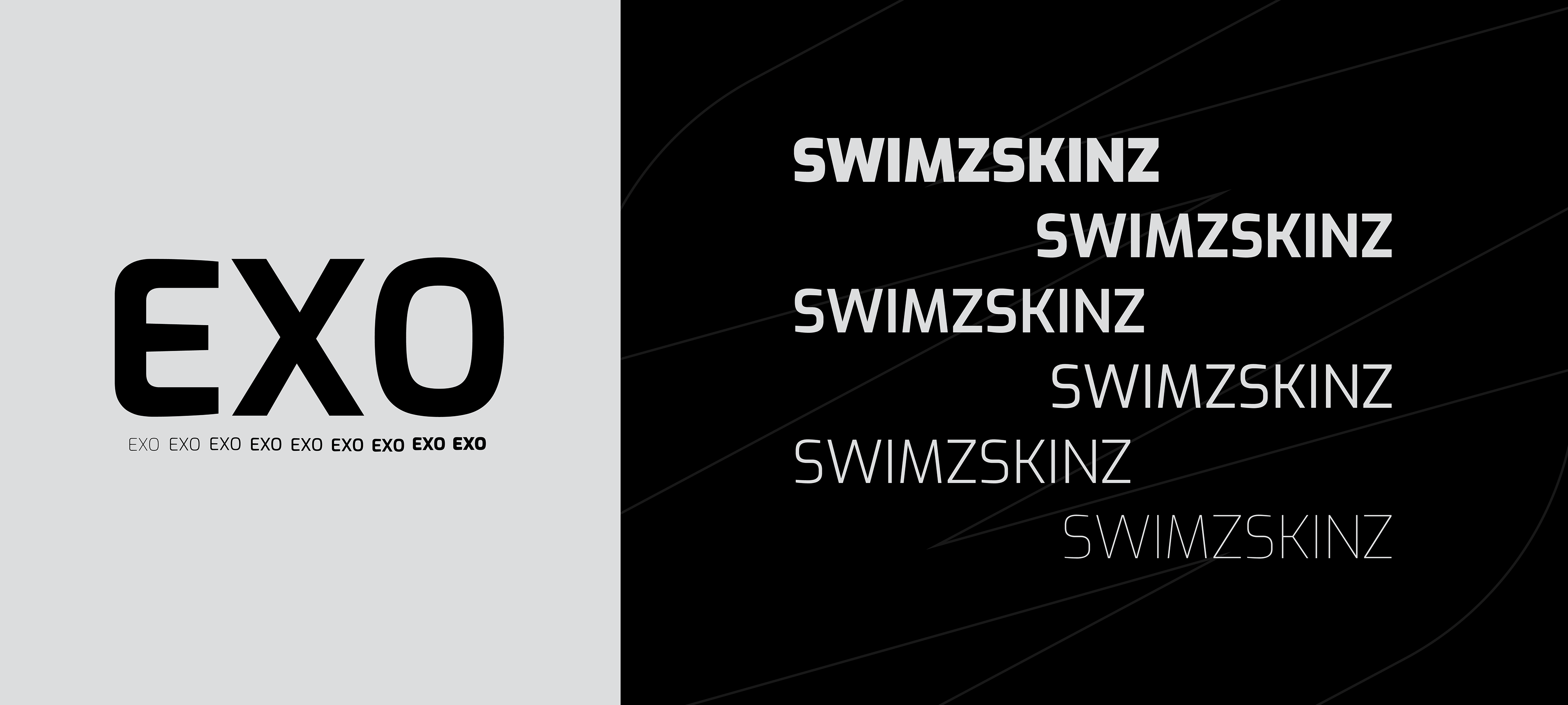
The Typeface
The brand needed a typeface that could carry the same energy as the logo without competing with it. Exo did both.
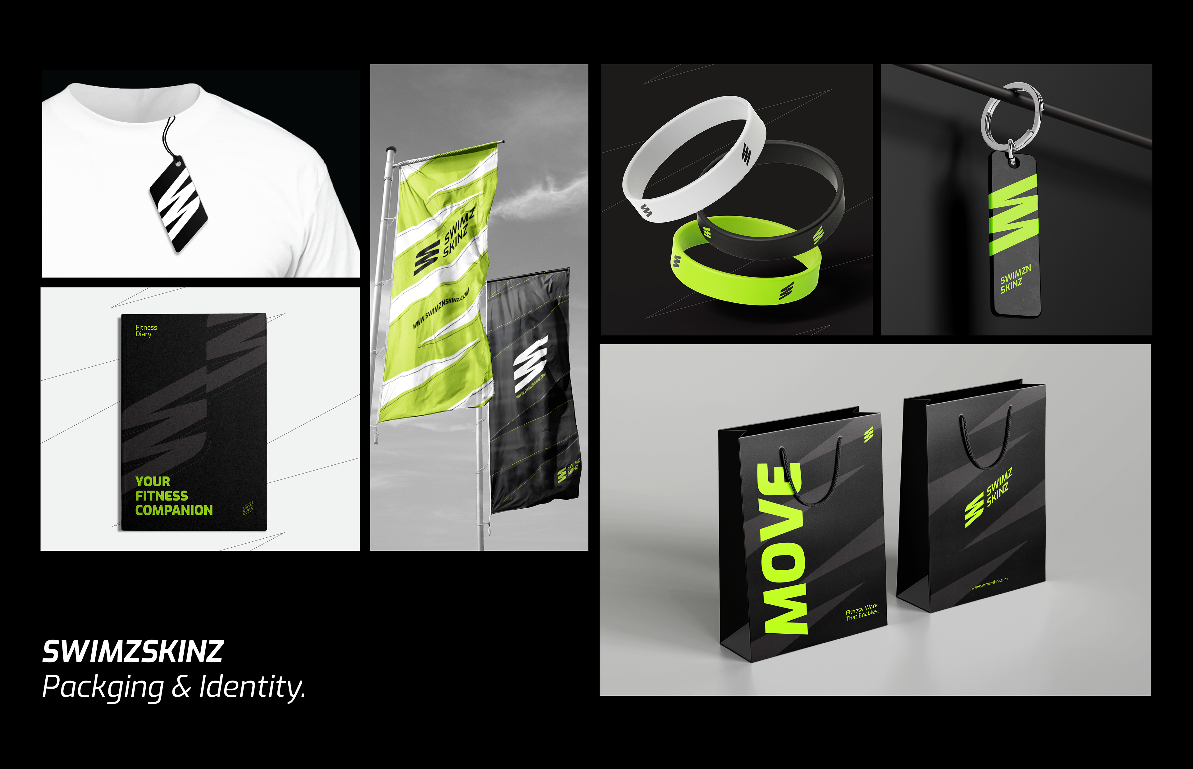
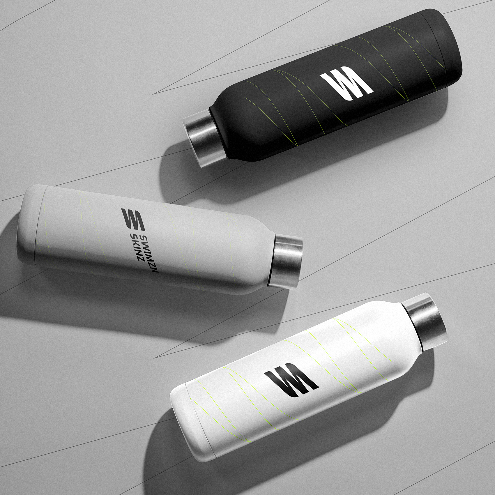
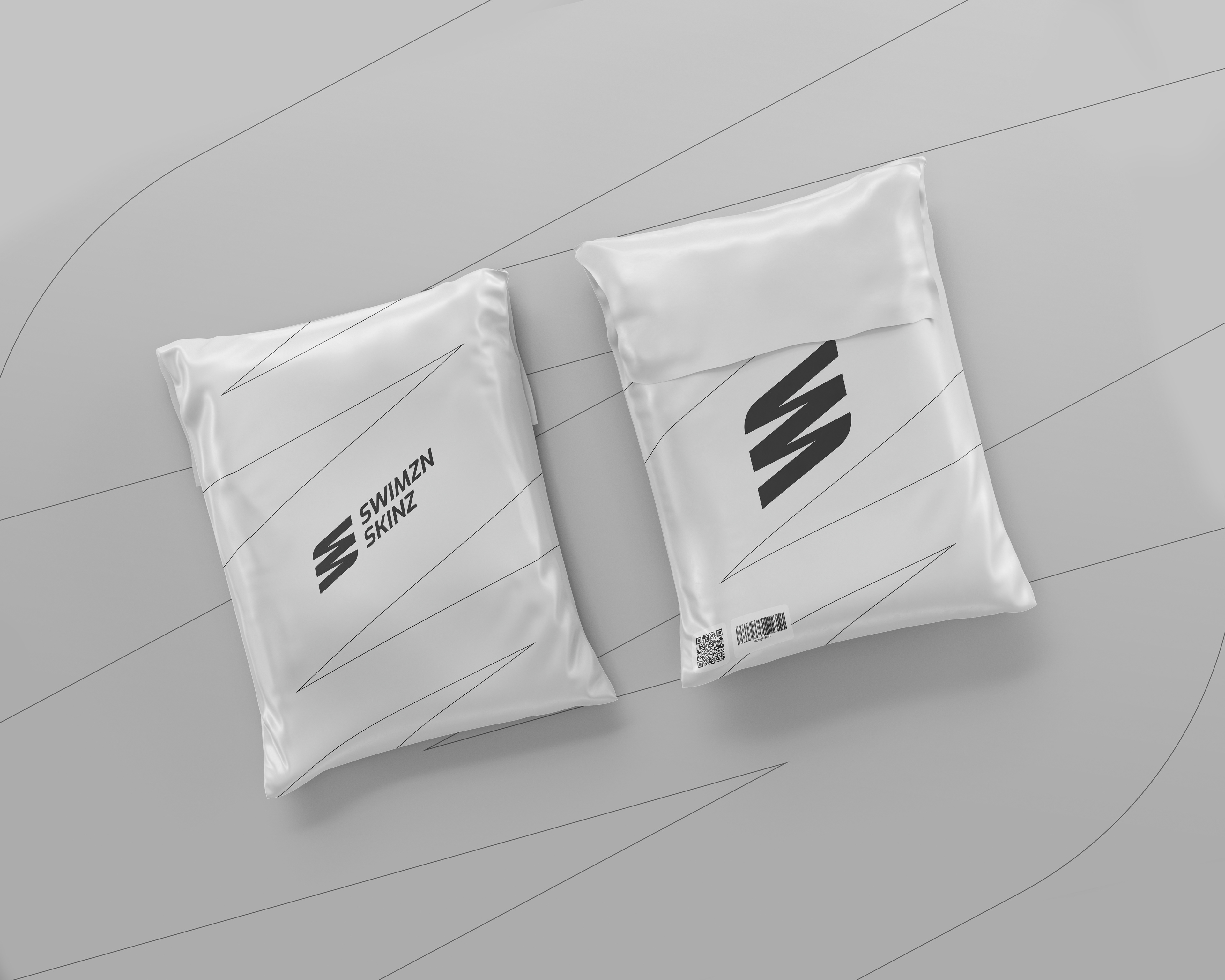
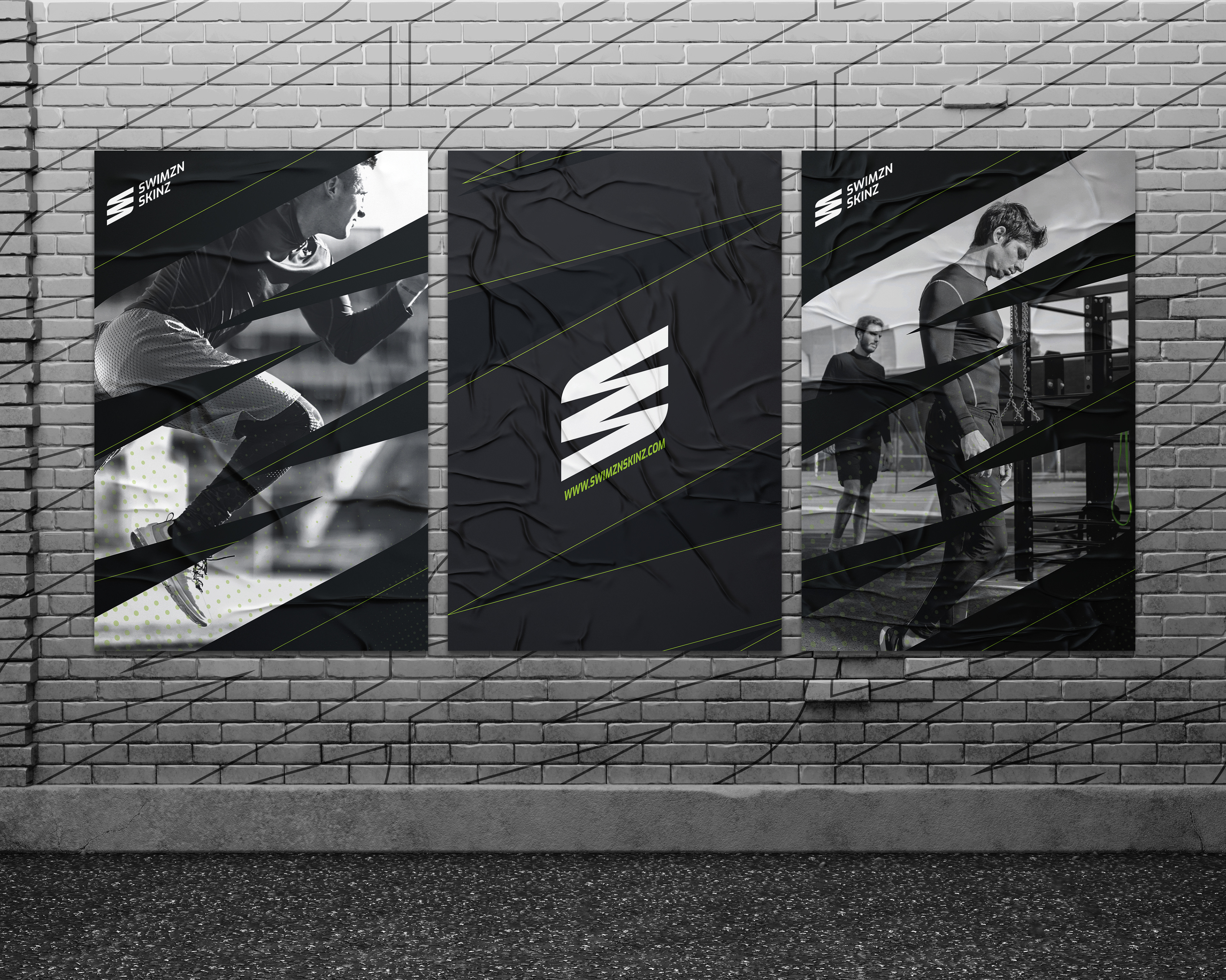
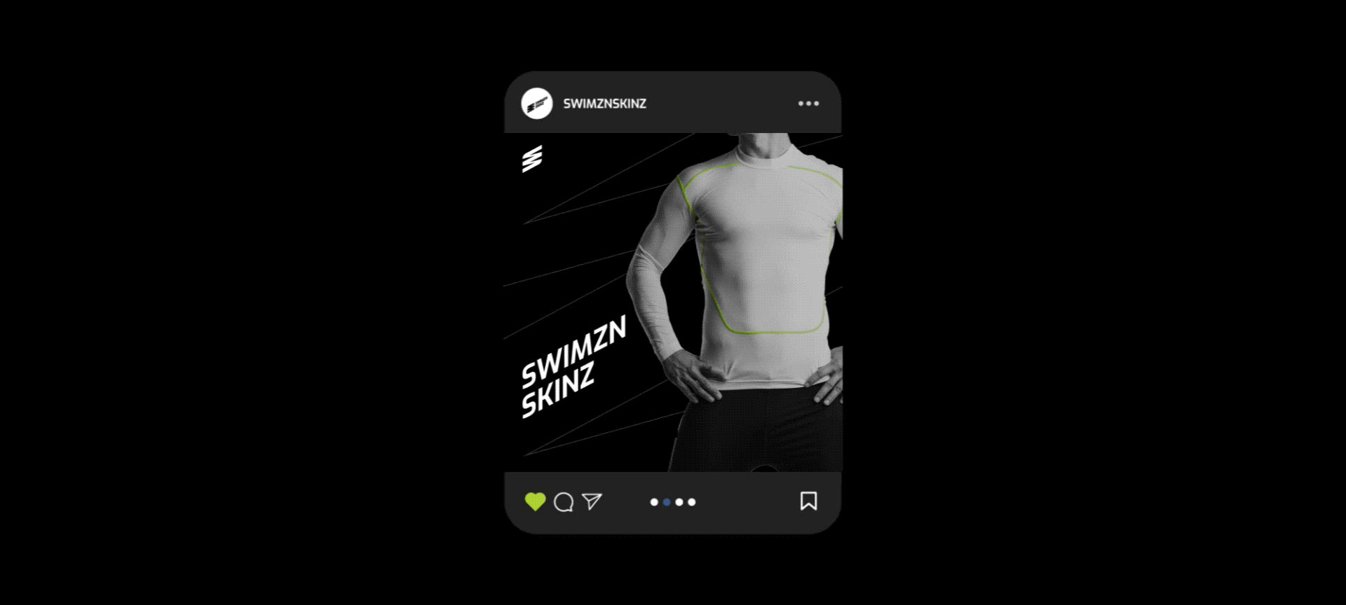
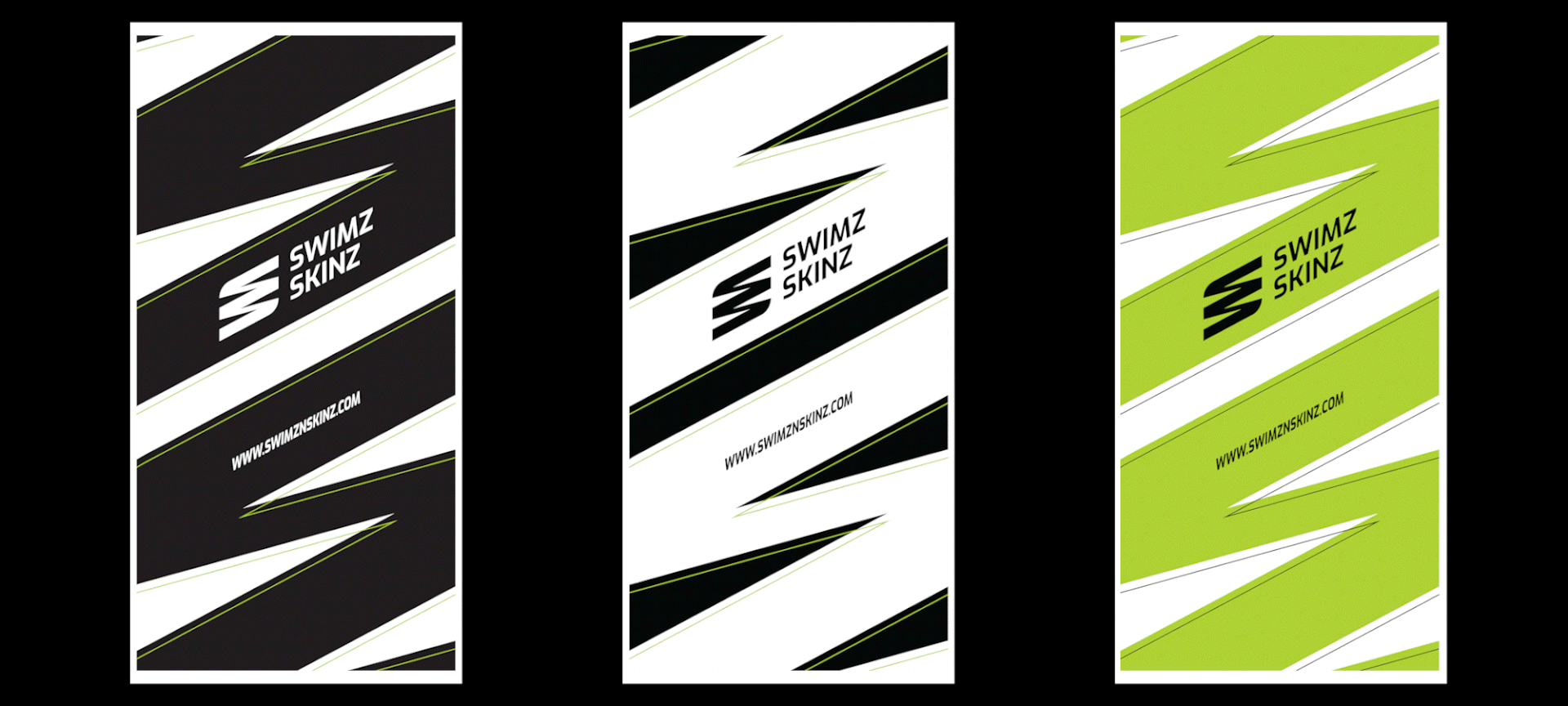
Brand Collateral
Here's how the identity came to life, across social media, giveaways, stationery, and every surface in between.