ROUTE REBRANDING
"We need a slight brand refresh, but don't move too far from the current identity."
That was the request from Route's CEO, Route is a training center specializing in software development and AI.
And our response was the usual: we research first, strategize, then decide.
Reading the Market
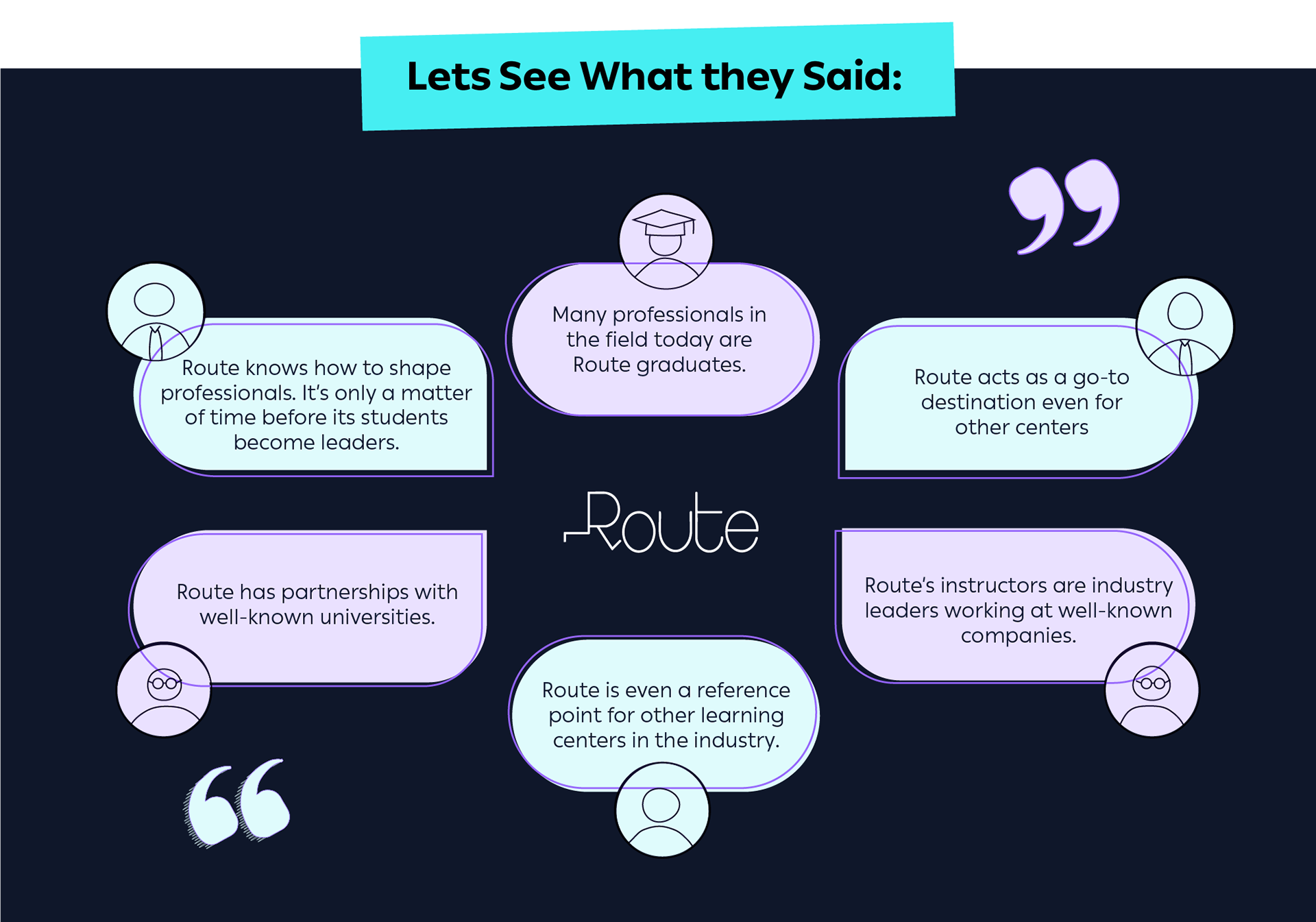
Before picking up a pen, we speak with current students, prospects, instructors, and even competitors.
The Gap
At that point, the gap showed up clearly:
Route was communicating like just another training center. While students, instructors, and even competitors were already treating it as the market leader.
The Decision
We went back to the CEO with one clear conclusion:
“Route's identity needed a full rebuild. Not a refresh. The brand was showing up smaller than the reputation it had already earned.”
We got the approval. We moved forward.
With the strategy set, the value proposition wrote itself:
The rebrand wasn't about changing Route. It was about letting Route finally look its size.
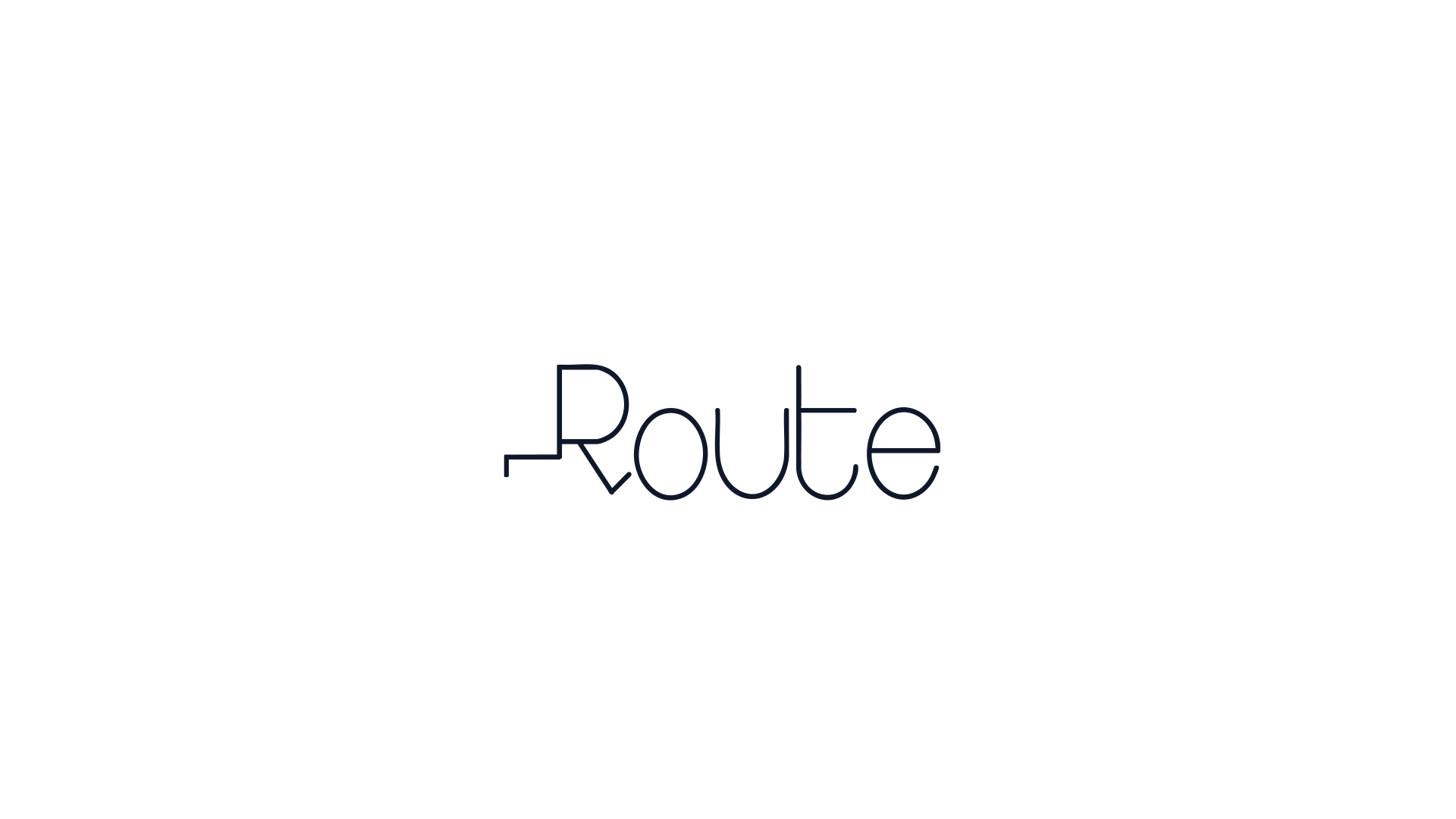
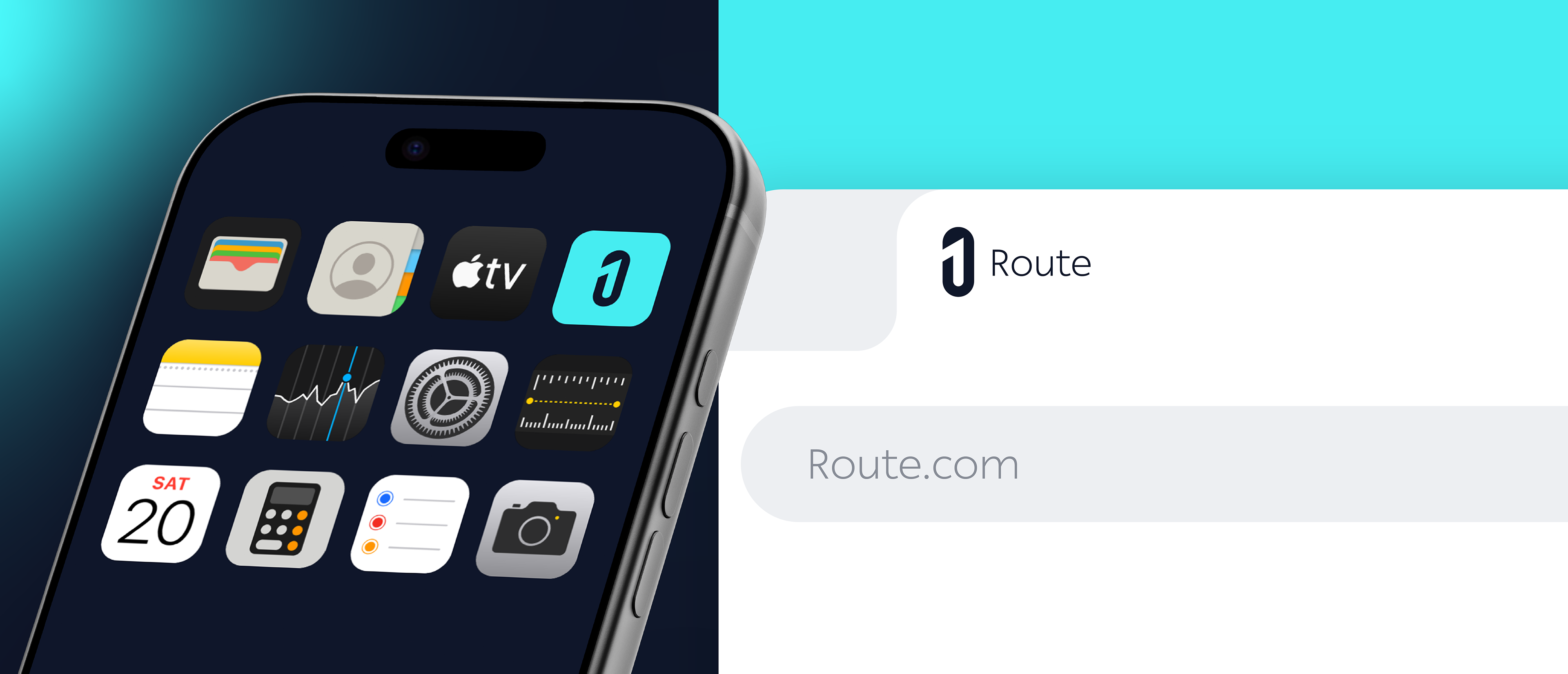
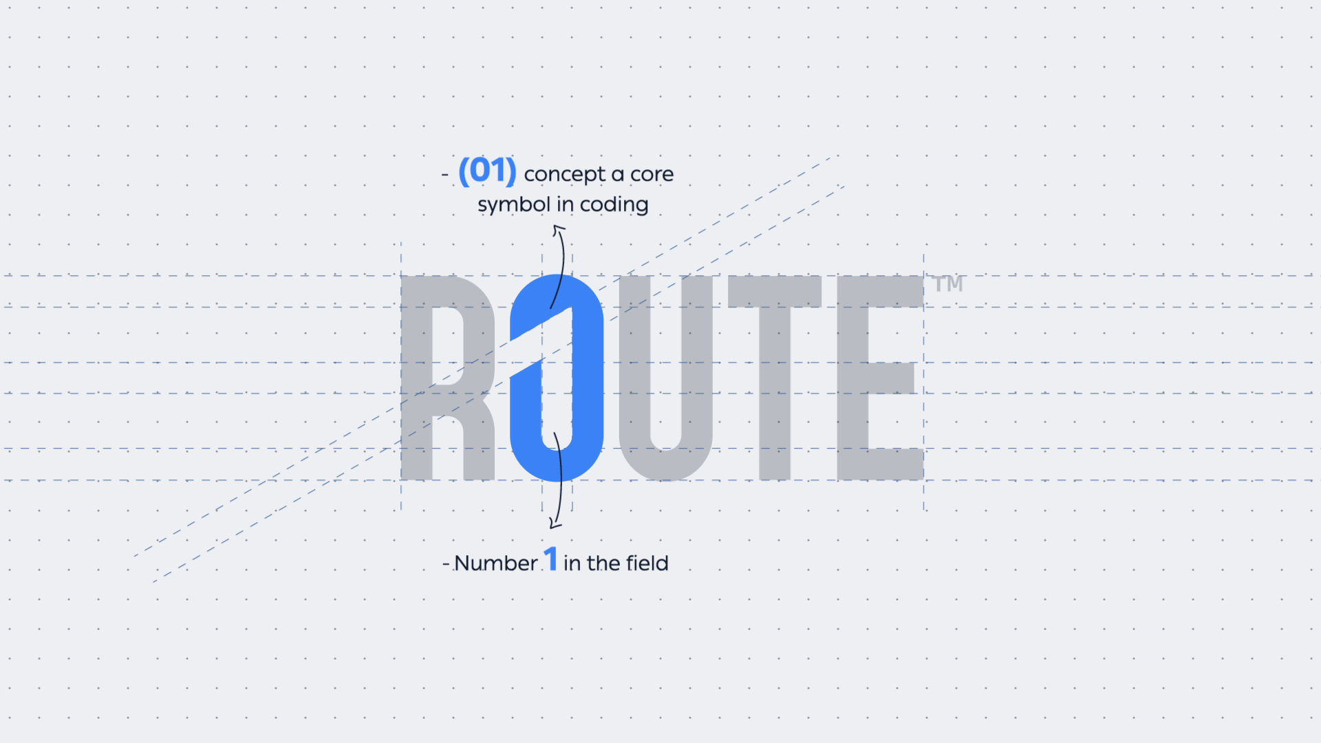
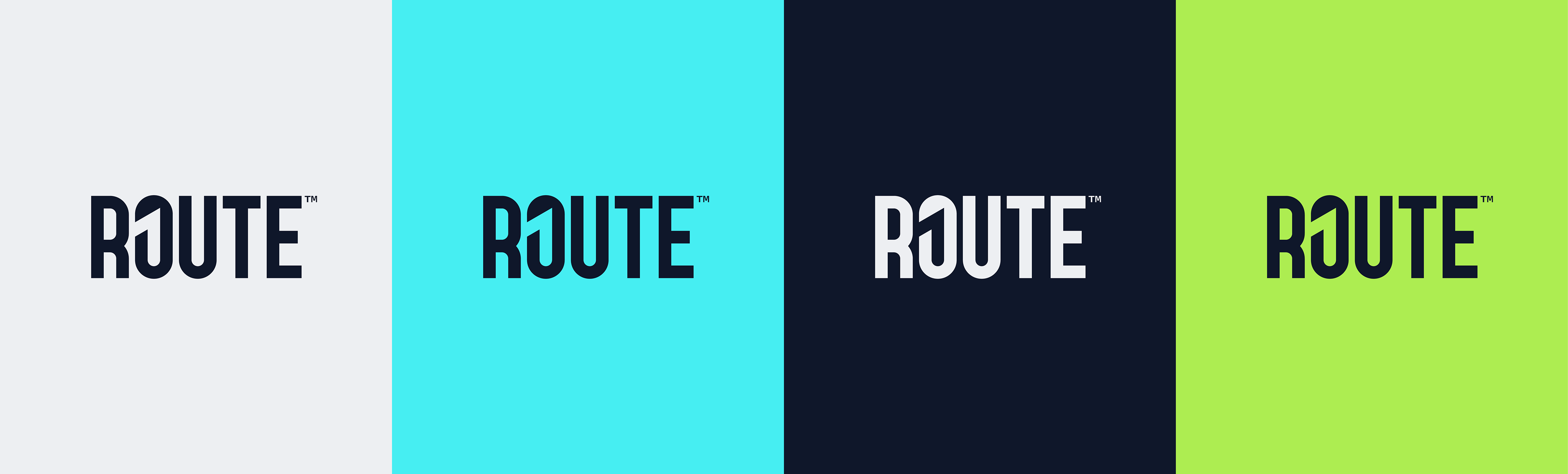
Logo Concept
We created a logo that does two things at once: deeply resonates with everyone in the industry, while subtly positioning Route as a market leader.
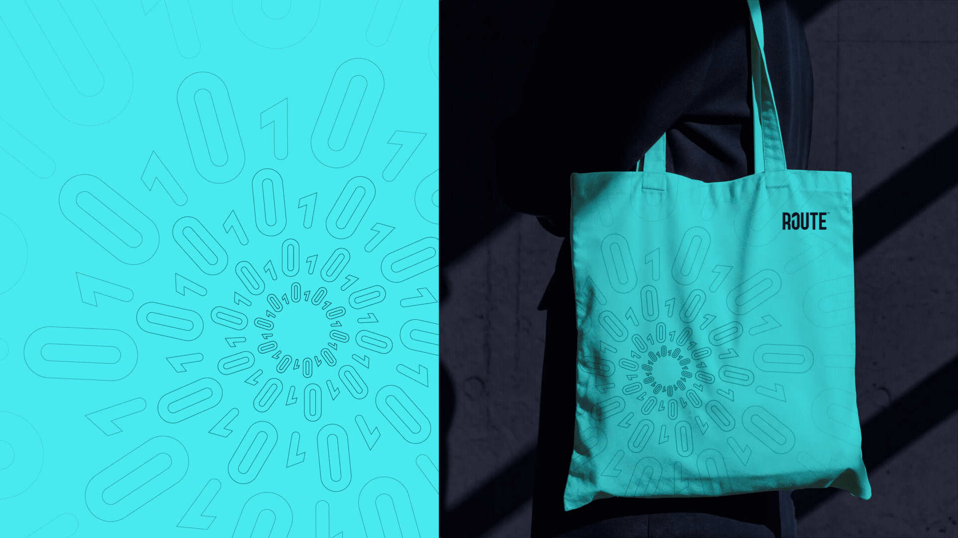
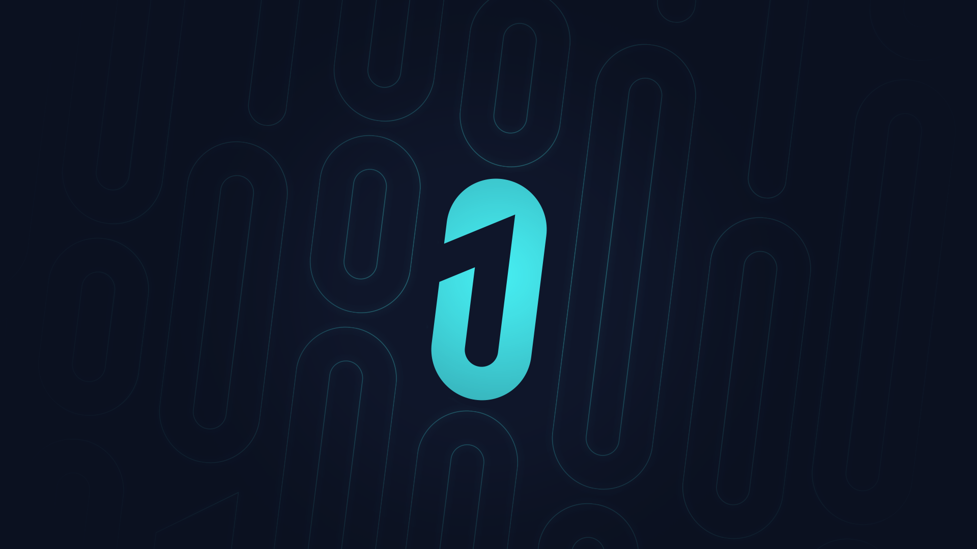
The concept is built around binary code (0 and 1):
a language every developer and engineer instantly recognizes. The “1” is seamlessly integrated into the letter, making a quiet yet powerful statement: Route is number one in its field.
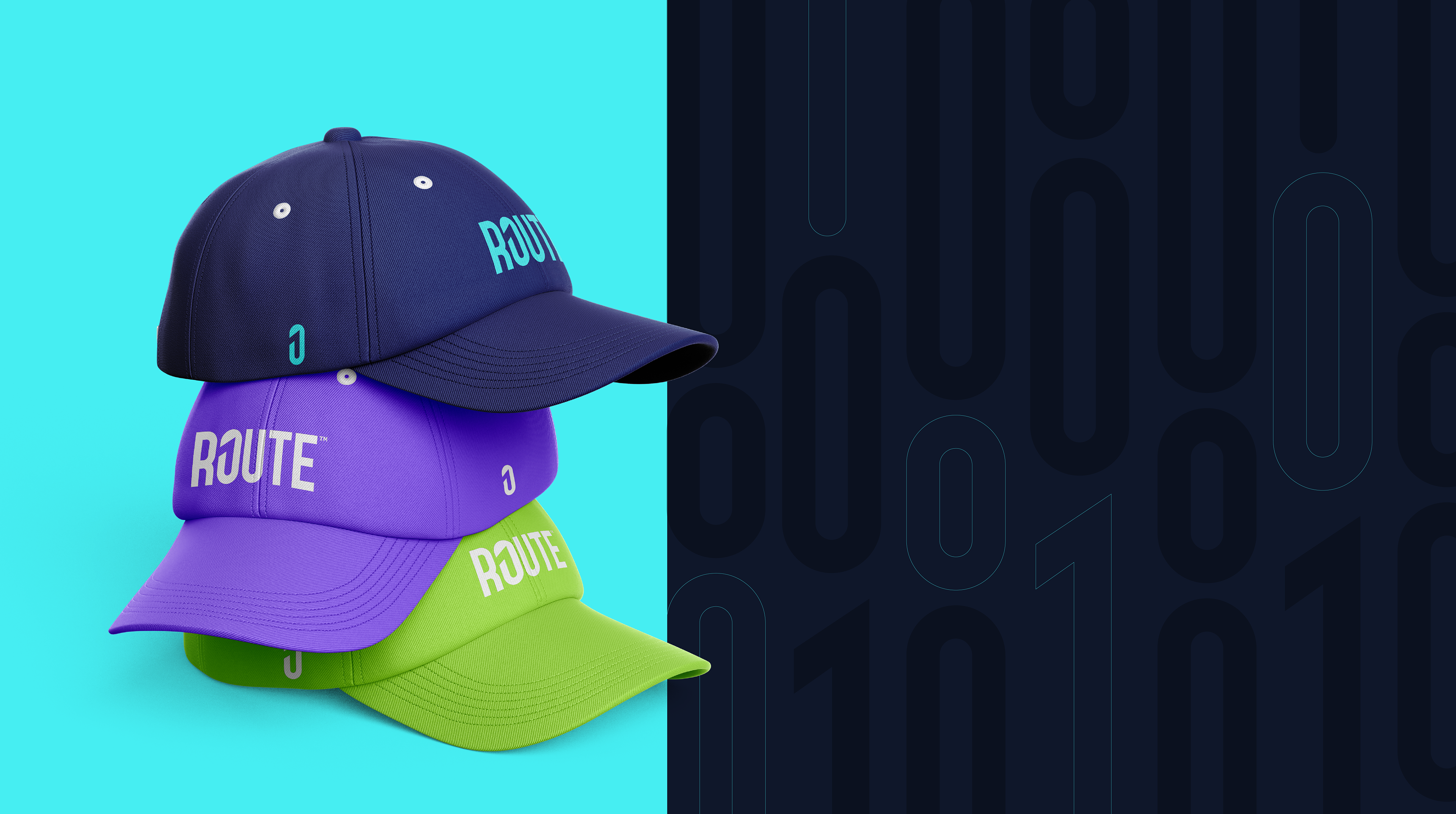
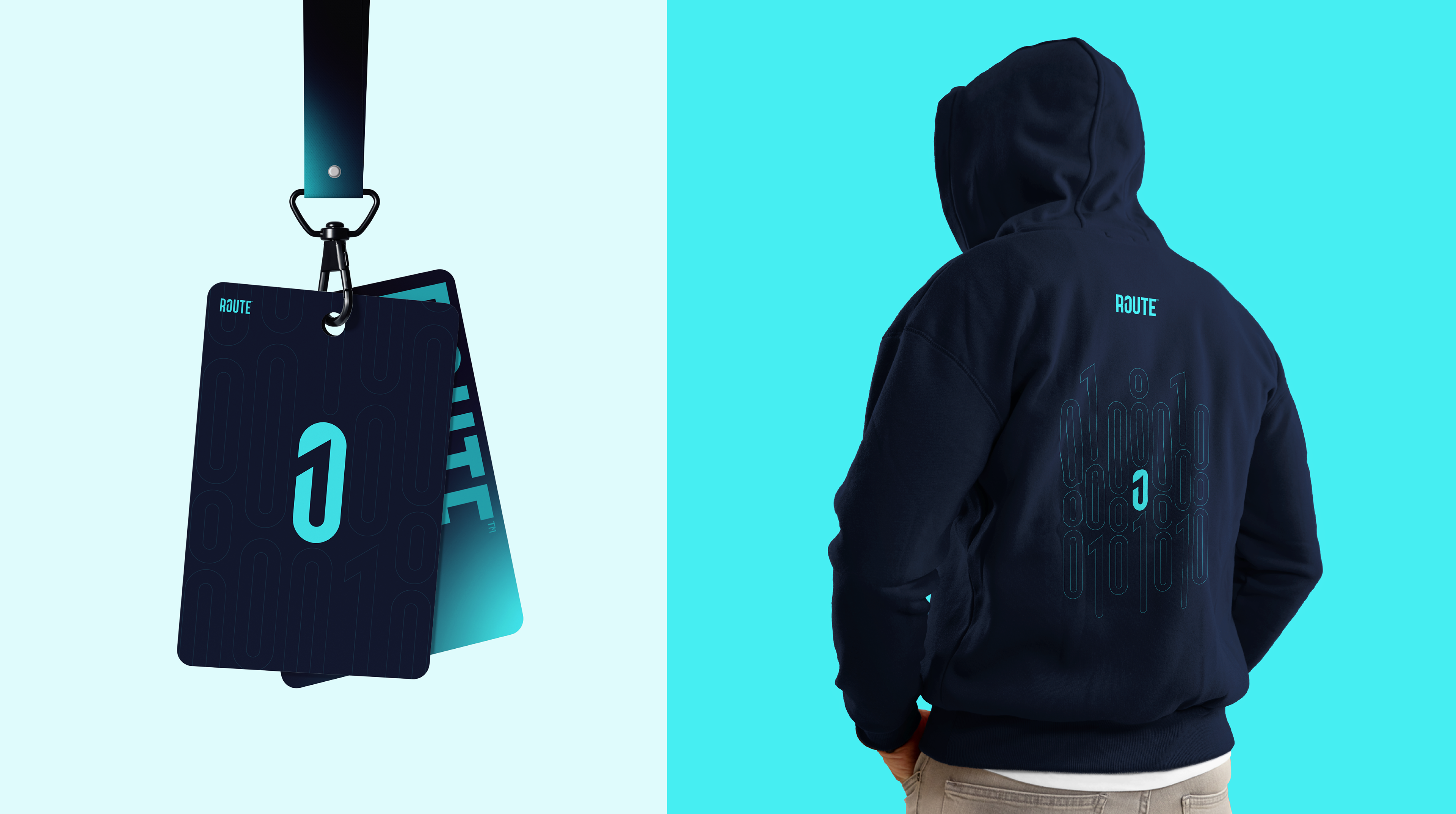
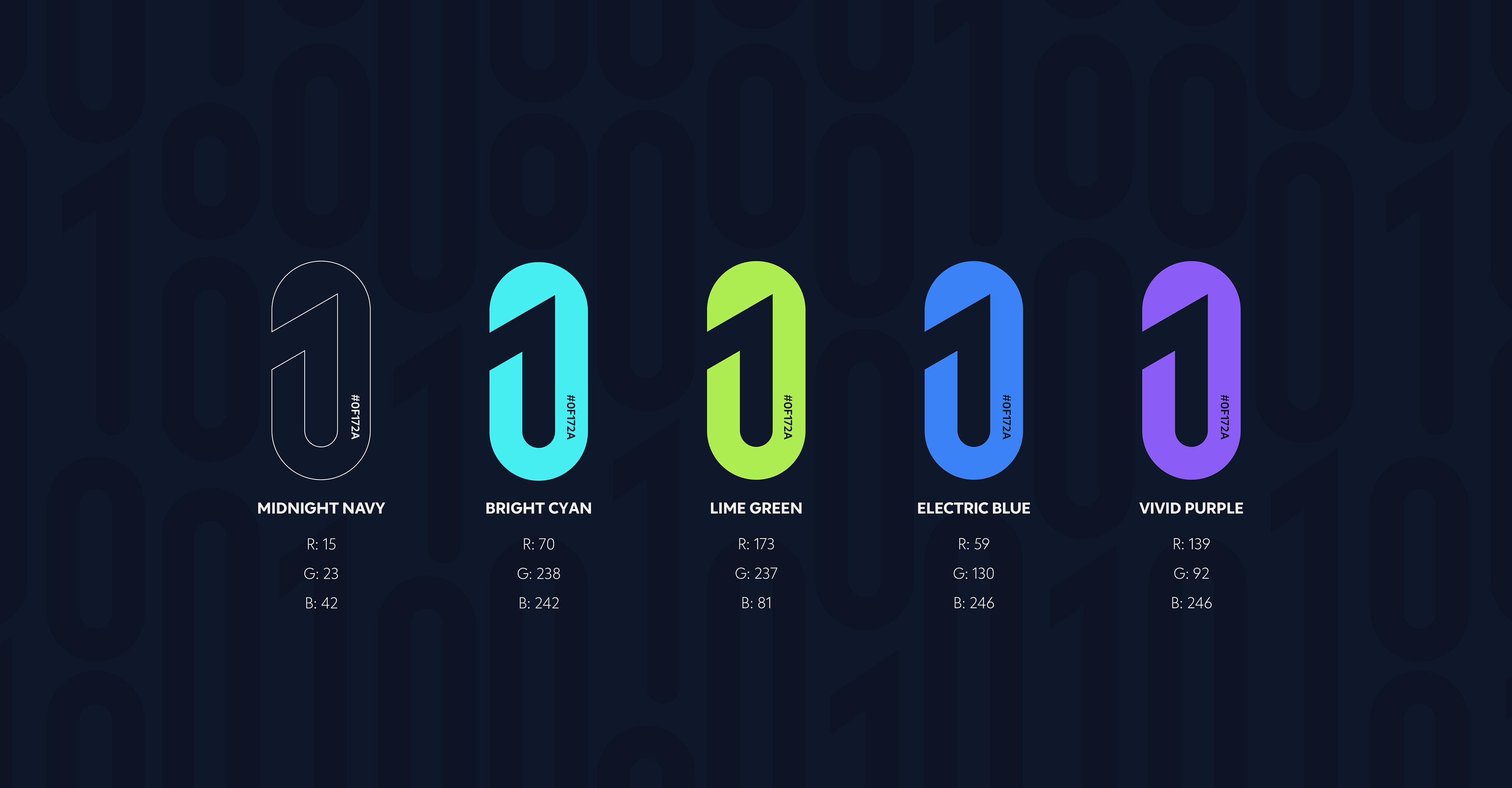
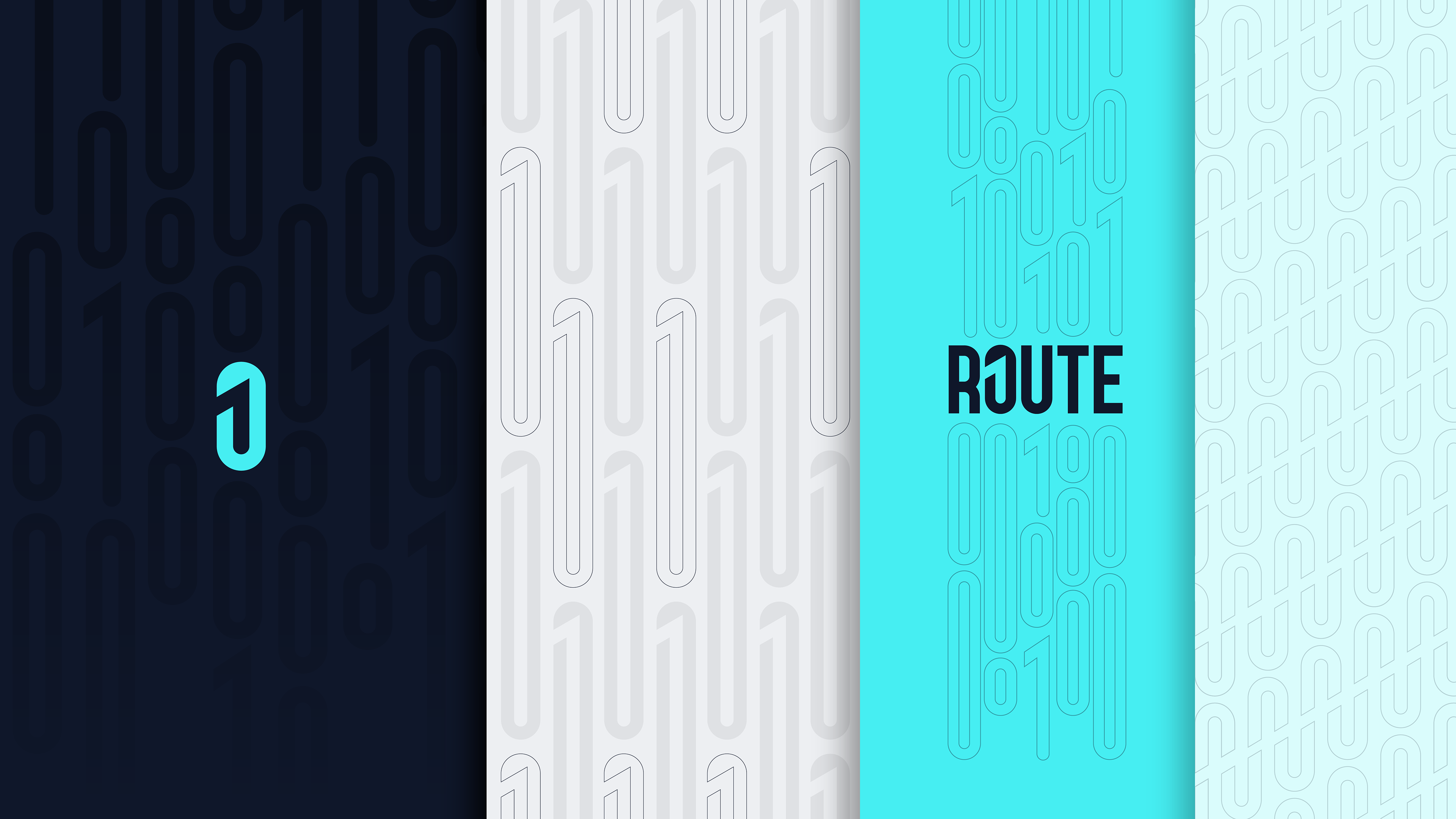
Color Palette
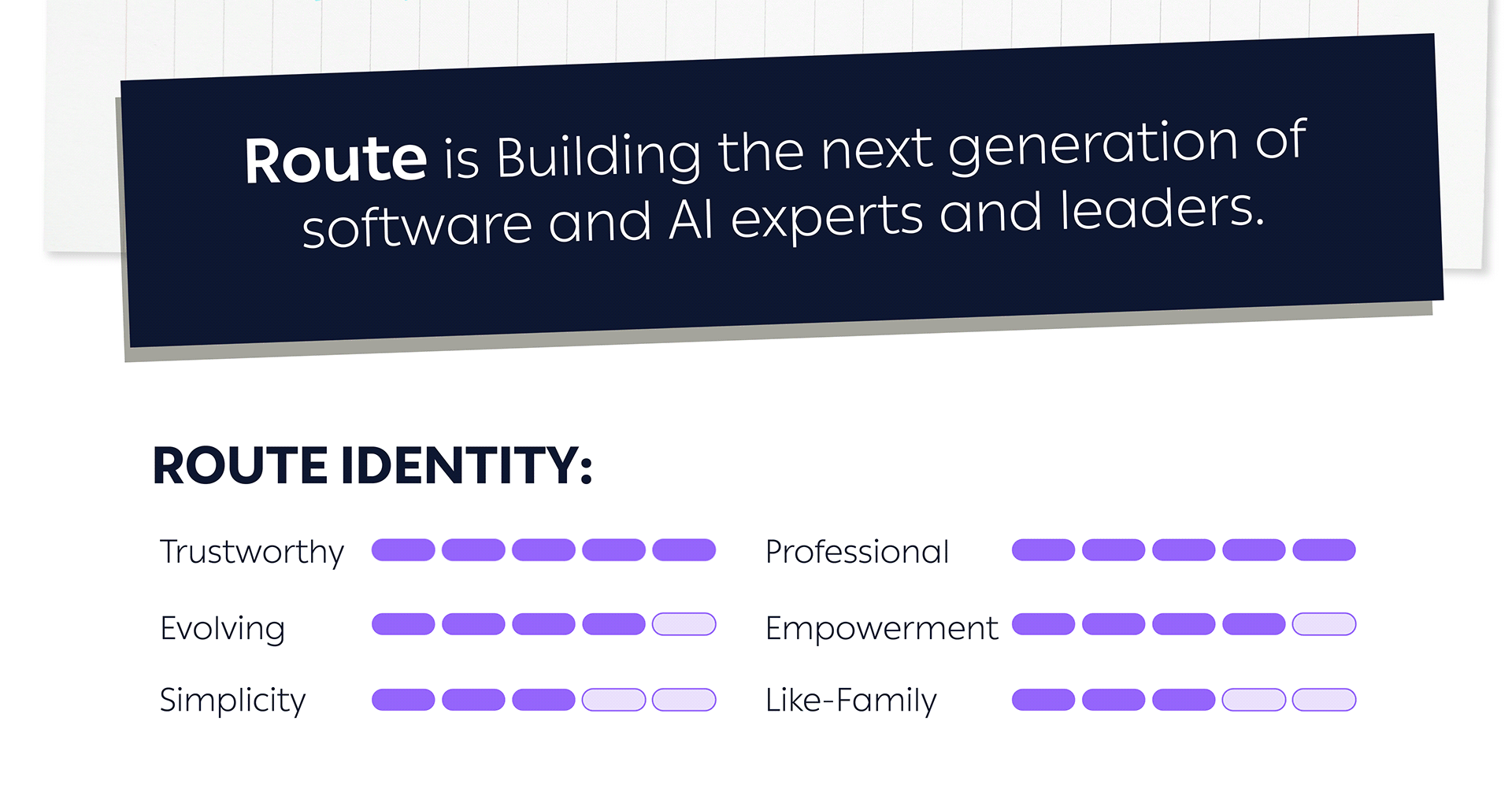
Do you remember Route’s character?
We are both trustworthy and professional, while at the same time modern, evolving, and simple.
That’s why we chose a palette that balances both sides, combining bold, modern tones that feel confident and established, while subtly positioning Route as a brand that is always evolving.
Brand Character
We created a character for Route that reinforces its positioning as an empowering, supportive community, one that feels like family.
The character is directly derived from the same logo concept and geometry, ensuring a fully consistent and cohesive brand system.

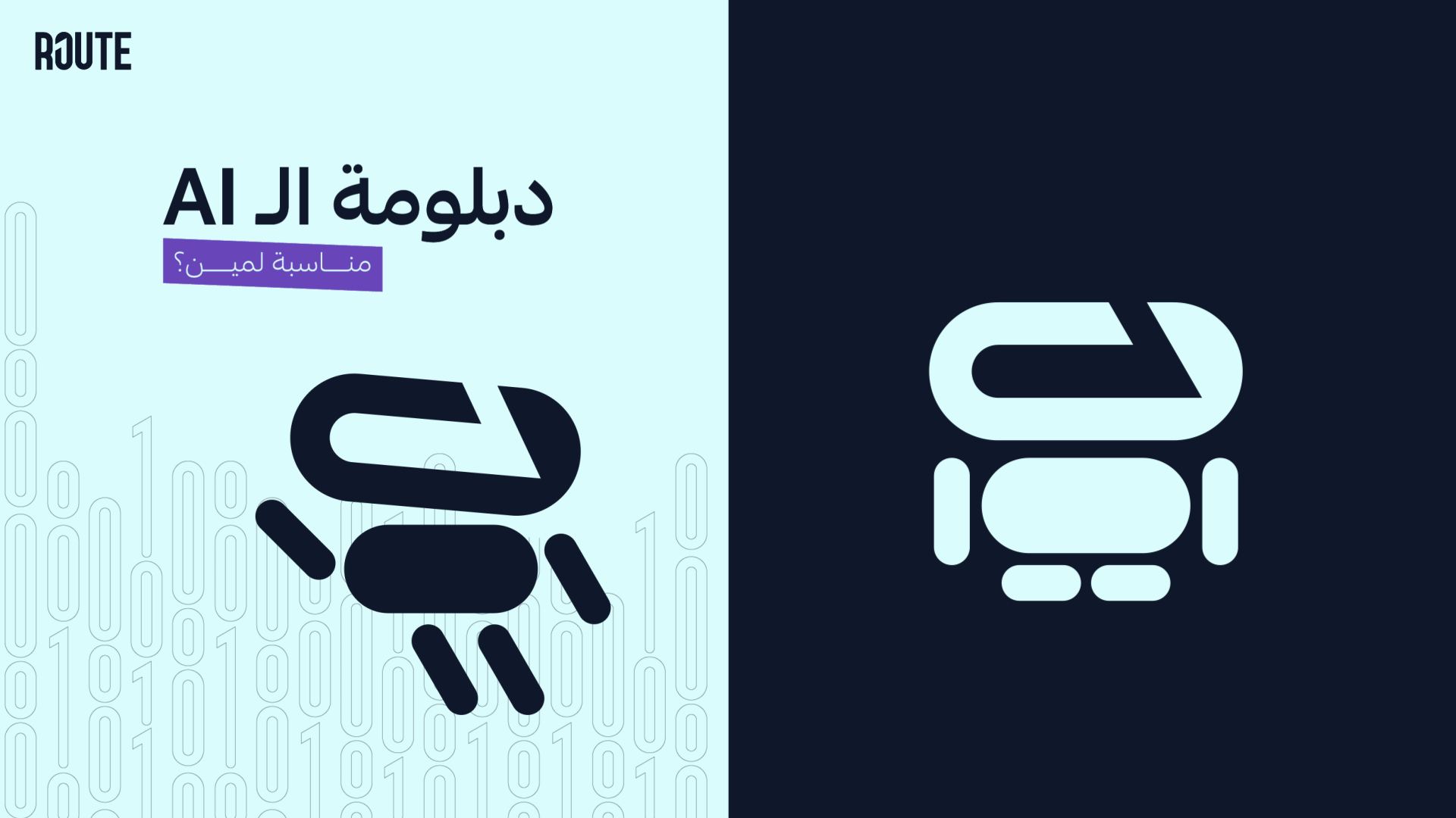
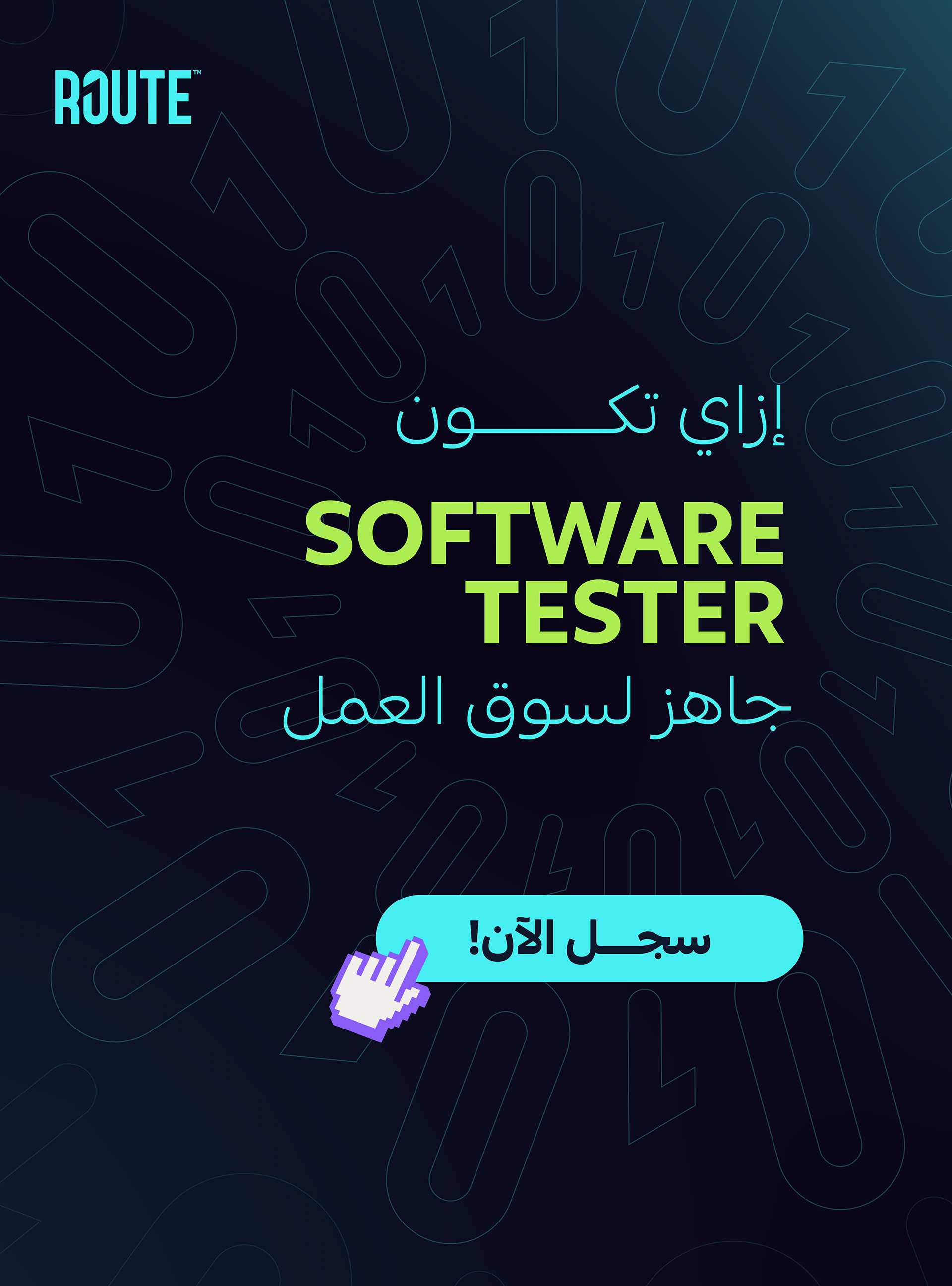
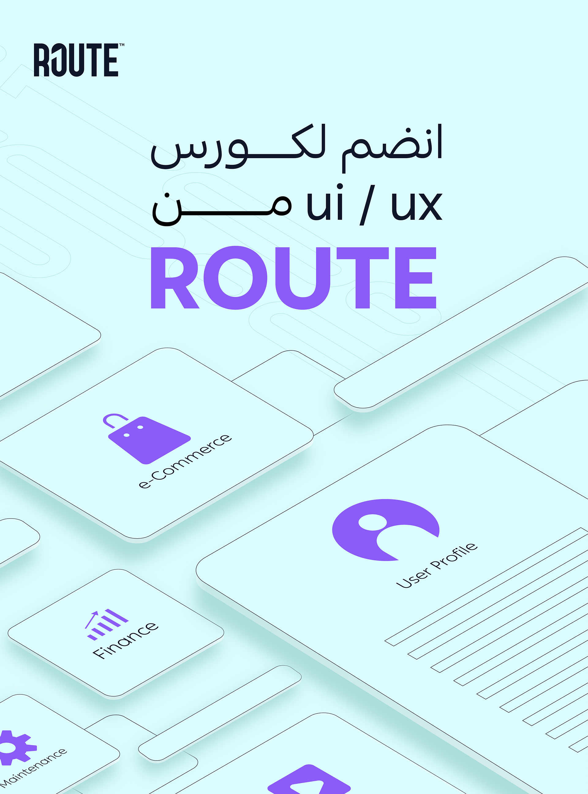
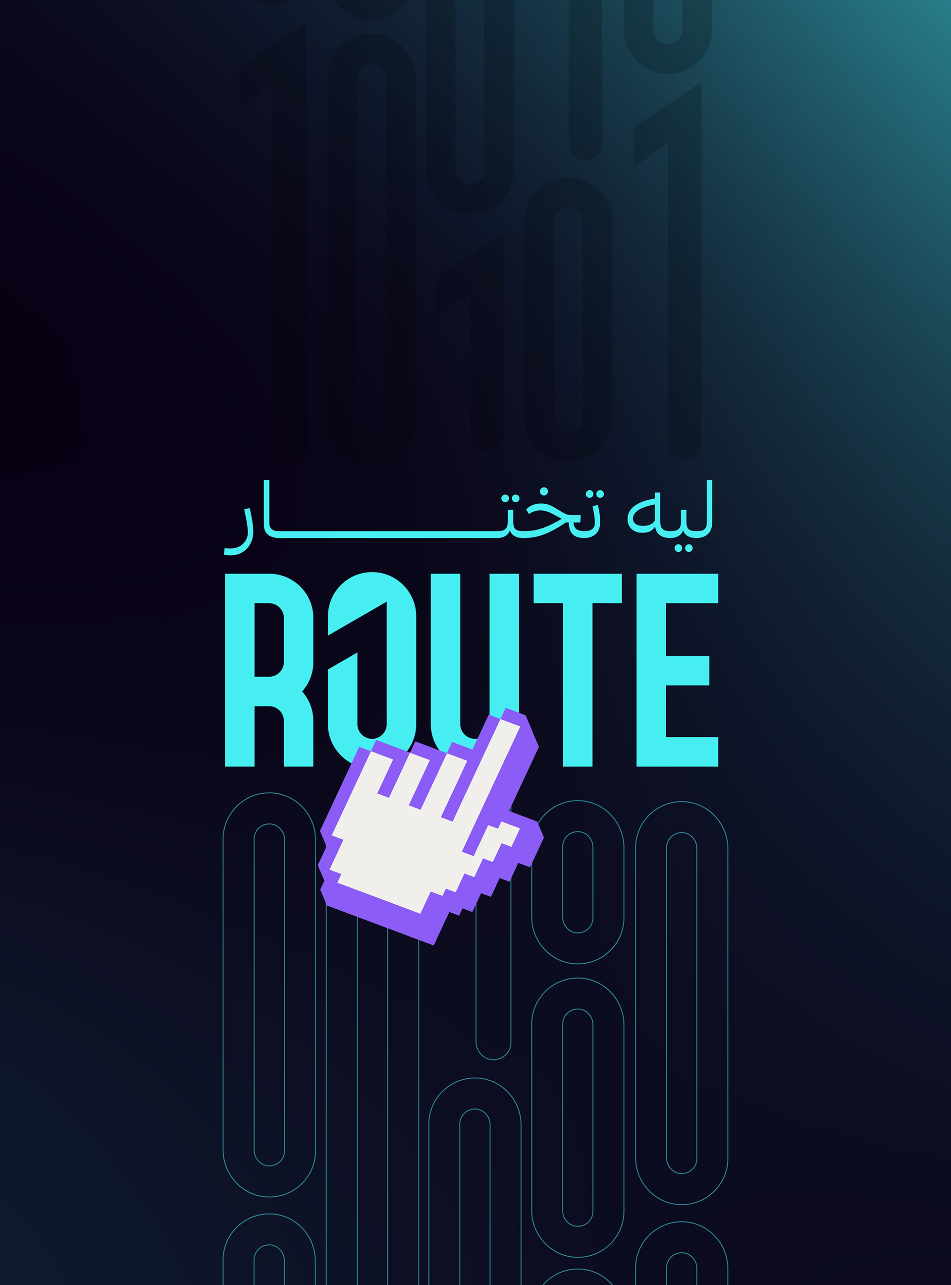
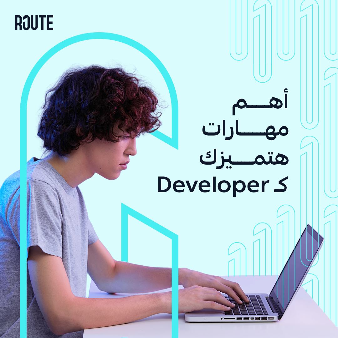
Social Media Look & Feel
On social media, Route may use real humans, full illustrations, the brand visual character, or typography-led designs.
Here’s how the identity will be applied across each scenario.
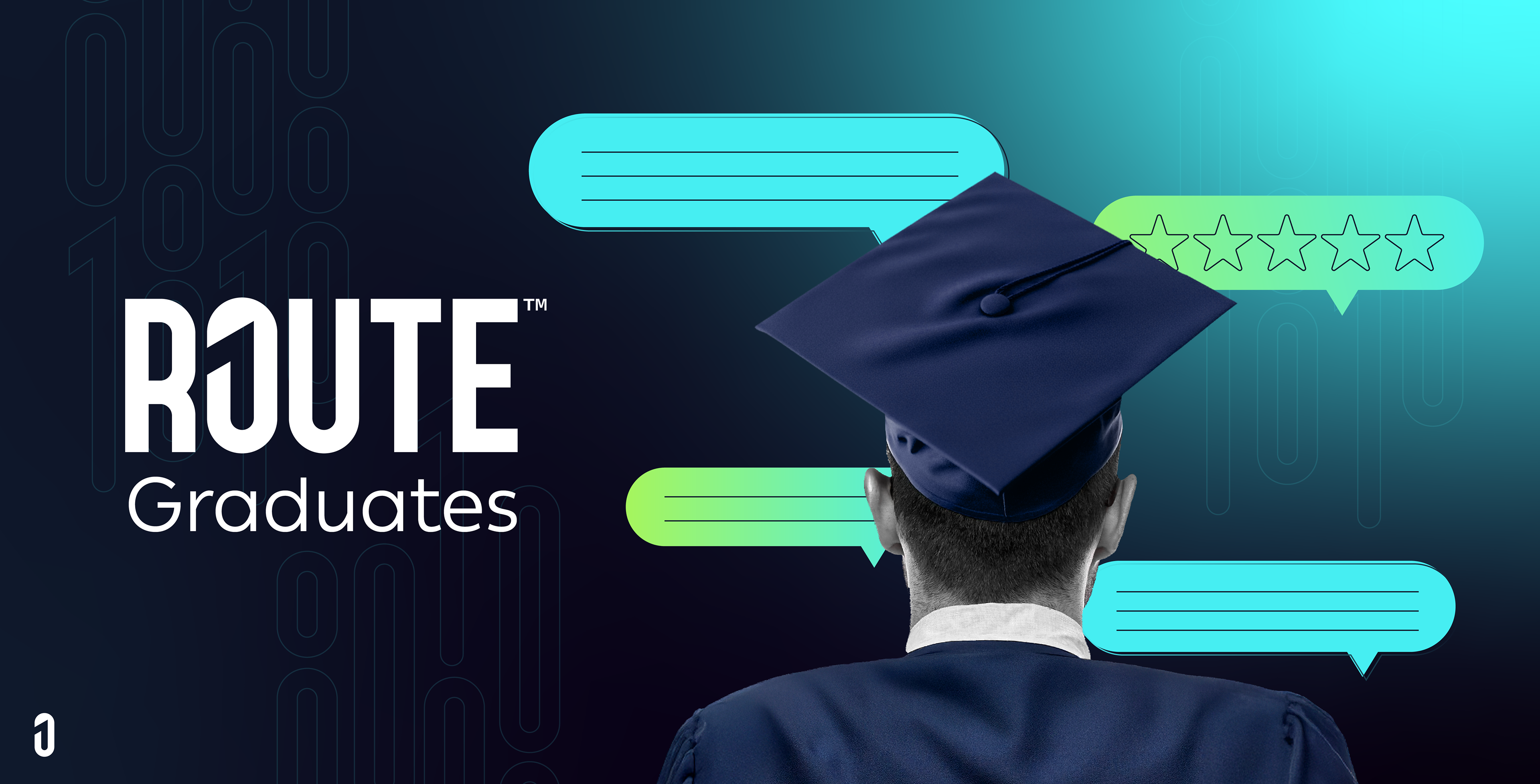

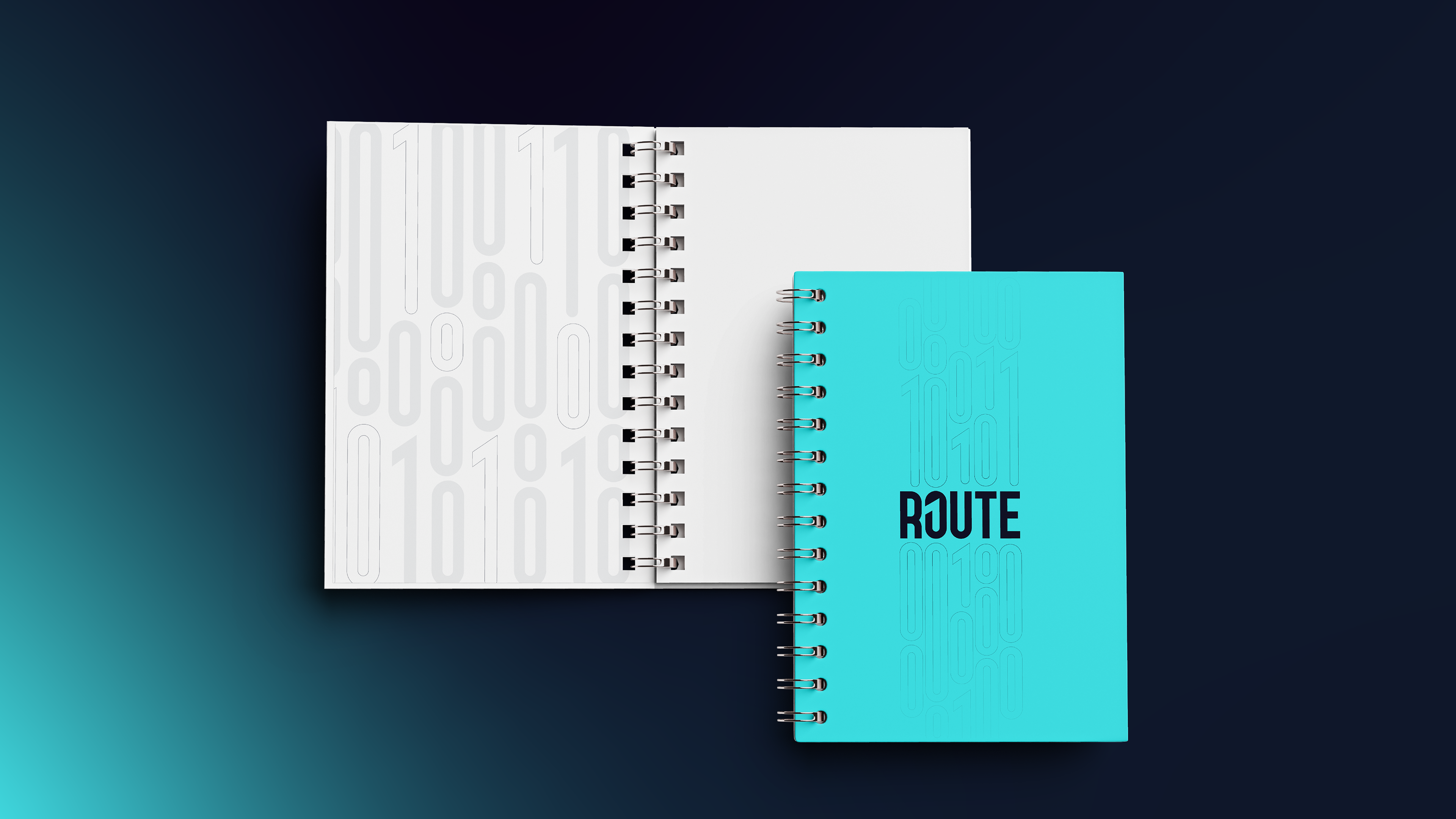
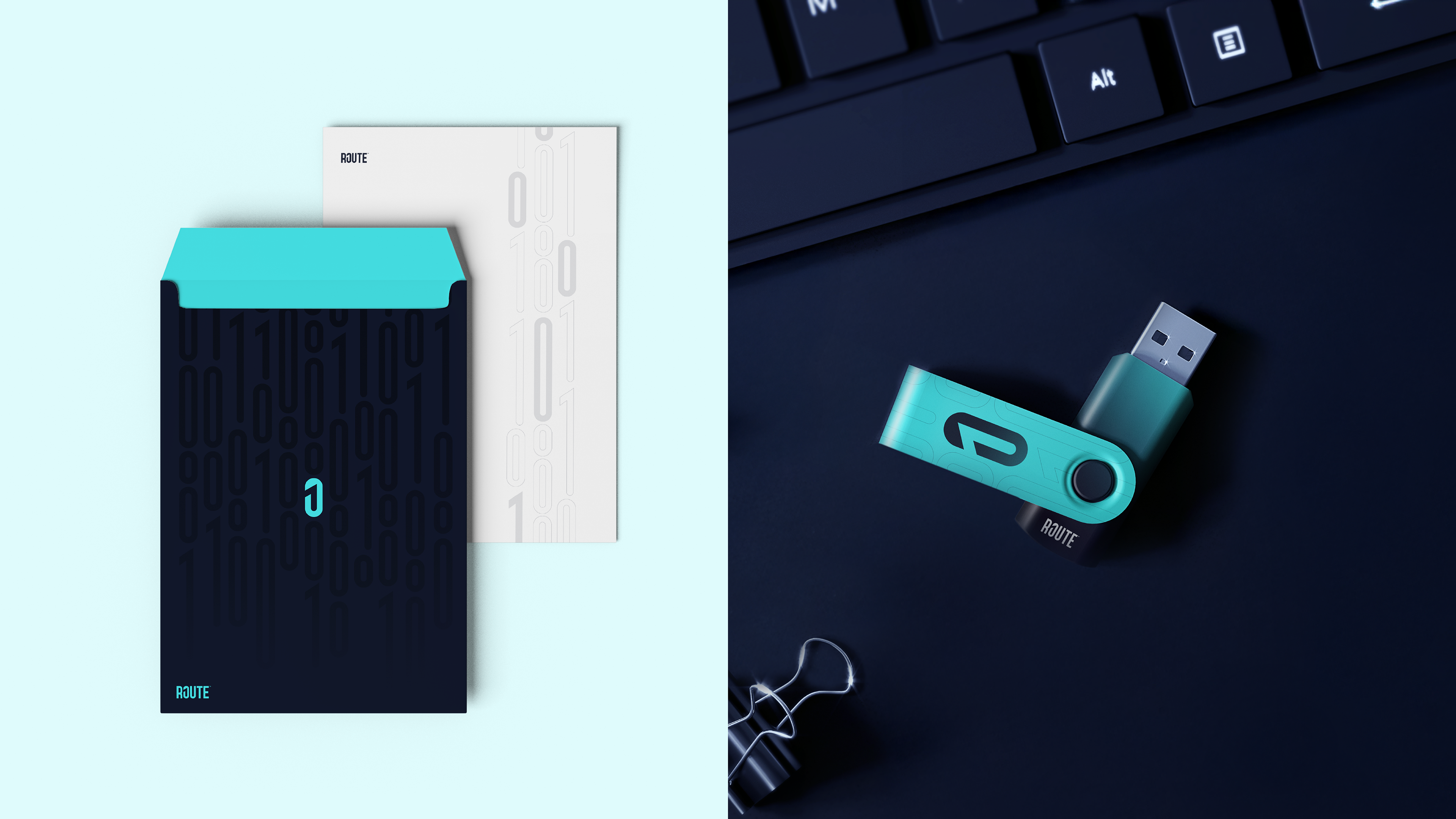
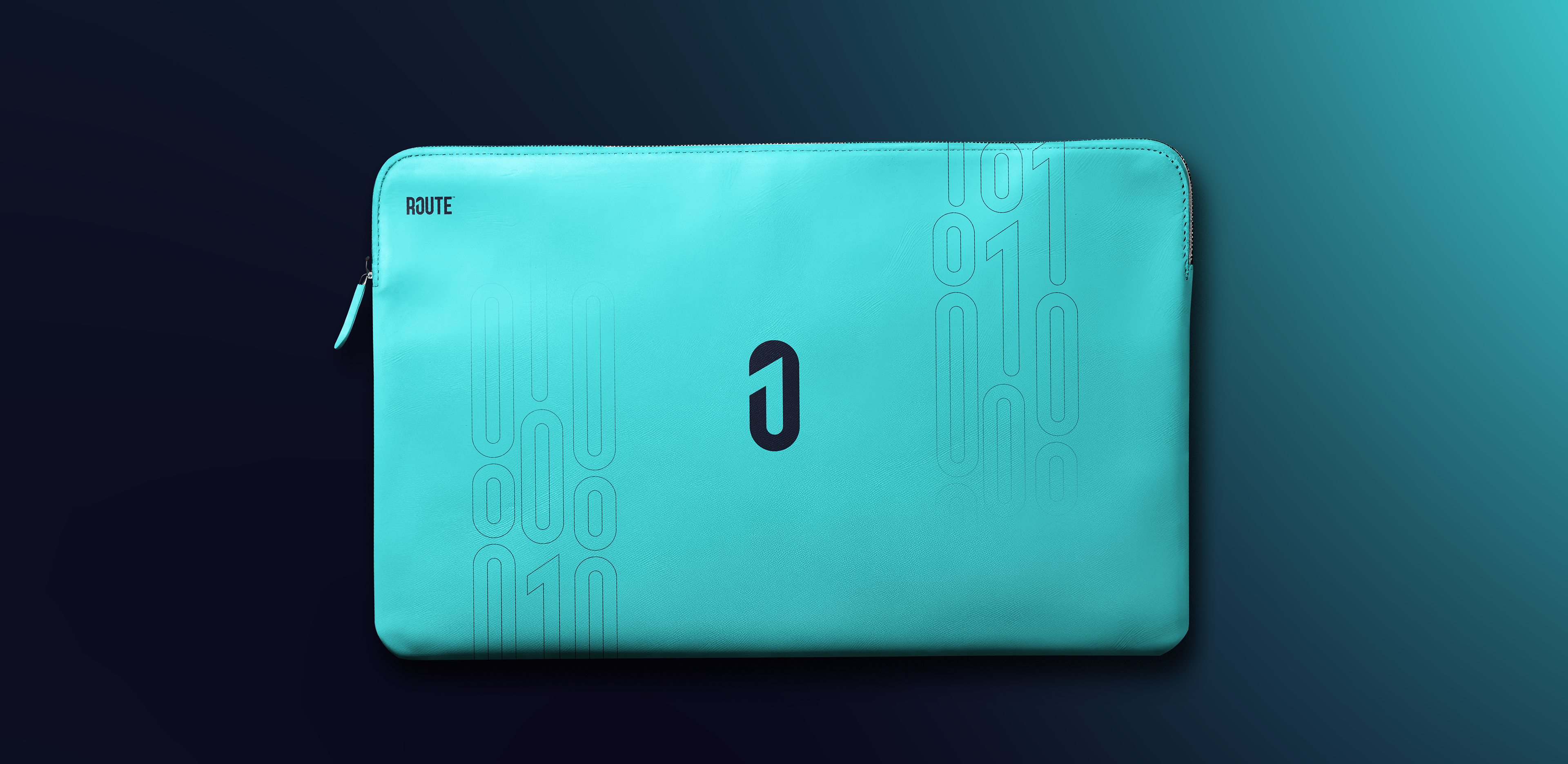
Brand Collateral
Route has almost 6 branches welcoming hundreds — if not thousands — of students every day. Here are a few examples that show how this identity speaks and feels across different touchpoints, with a strong focus on the offline experience.