
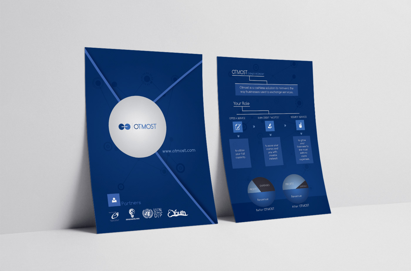
OTMOST is a Business-to-Business Bartering Platform.
It is a platform where Businesses can exchange the services they offer for the services they need without Spending any Money.
OTMOST platform helps businesses to grow the most.
Utilizing this platform only requires 4 simple Steps:
1- Join the Platform 2- Offer Services
3- Earn Credit 4- Request Services
3- Earn Credit 4- Request Services

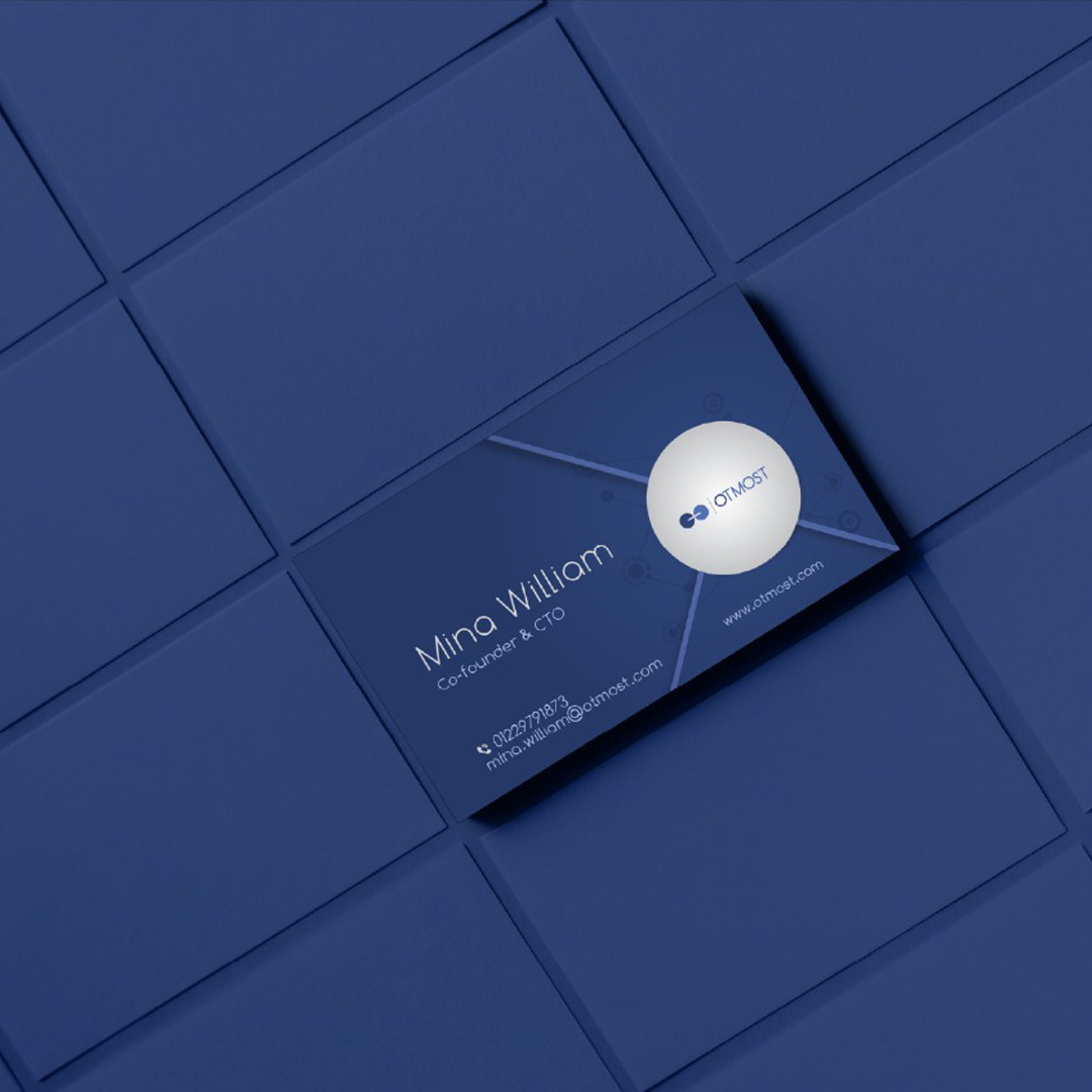
OTMOST team approached us to create an integrated visual identity.
The barter system is outdated, But OTMOST as a platform is new, innovative, and smart!
And Here was the challenge!
The barter system is outdated, But OTMOST as a platform is new, innovative, and smart!
And Here was the challenge!
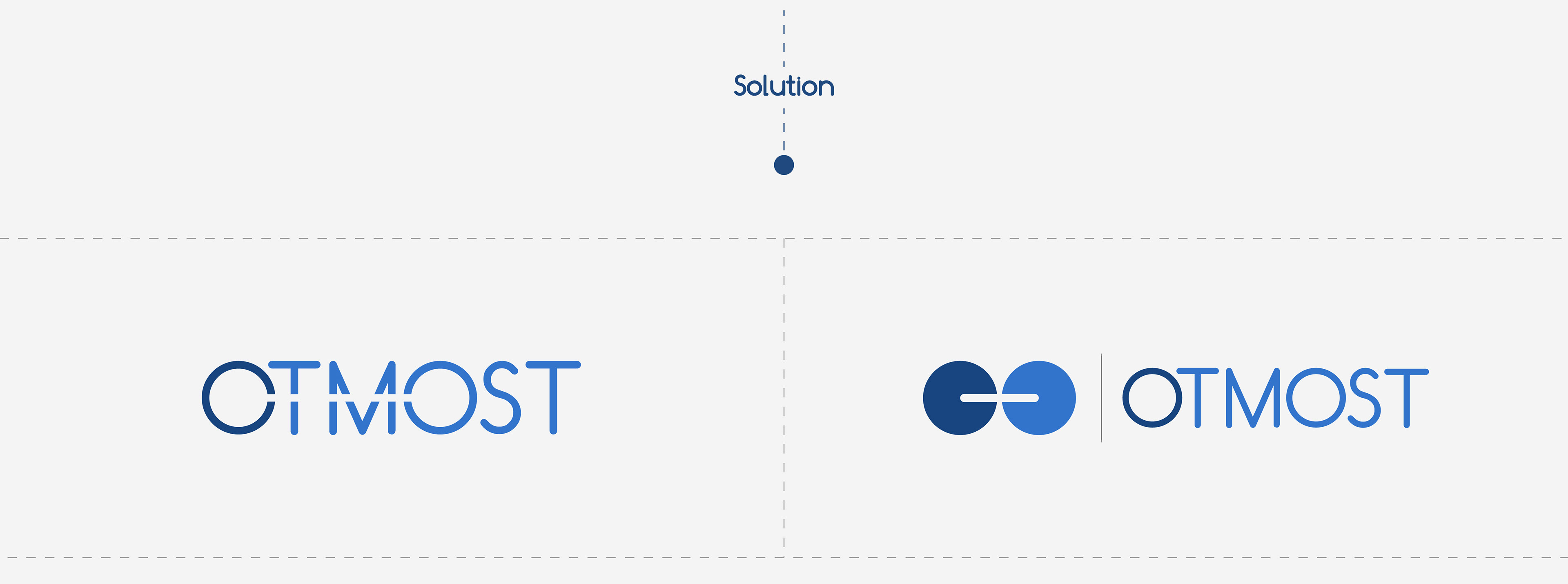
Logo Concept:
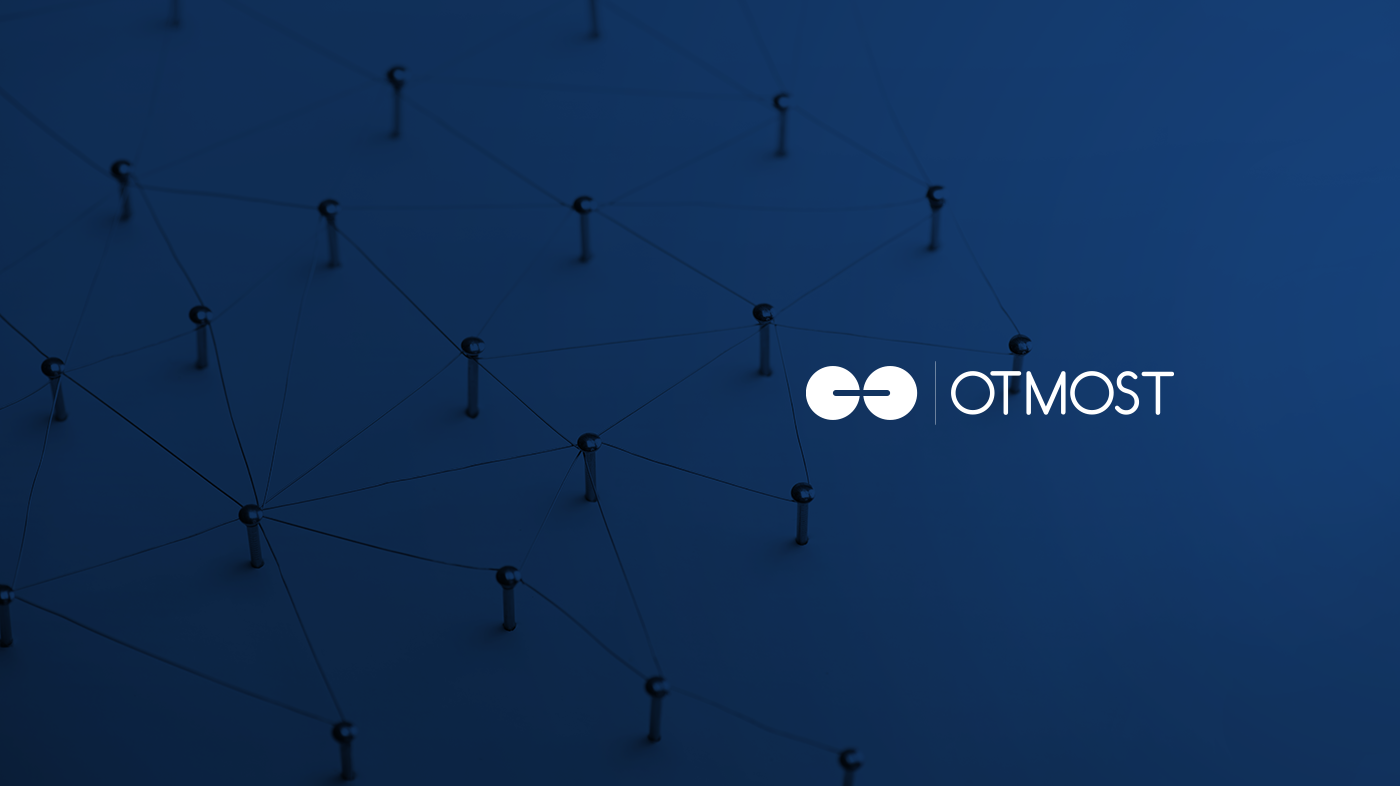
The word OTMOST Contains two Os or two Circles.
We link them by drawing a line in the negative space.
We link them by drawing a line in the negative space.
1- The line linking the two circles or the two Os
symbolizesexchanging, which is OTMOST's main value proposition.
2- The line is designed as a Negative Space to represent
the platform's smart solutions and indirect digital communication.
the platform's smart solutions and indirect digital communication.
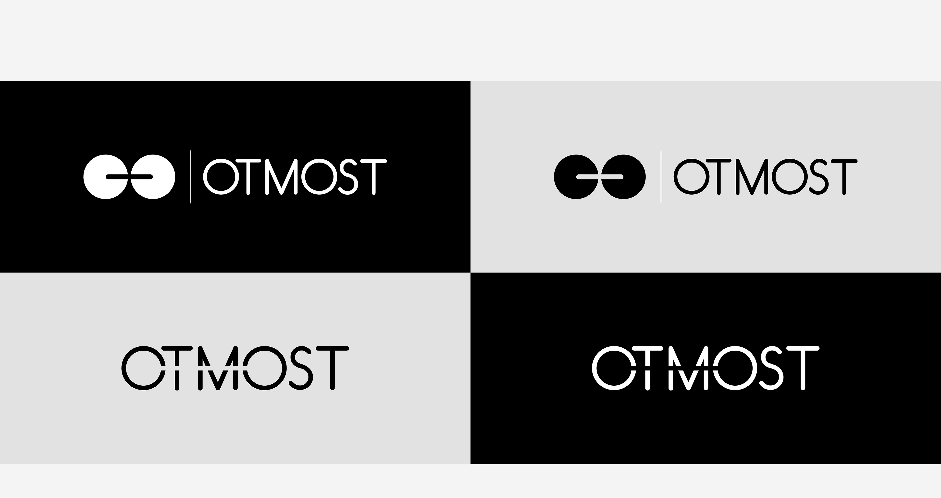
3- The logo is entirely abstract in order to express
the brand's formality and dynamism.
the brand's formality and dynamism.


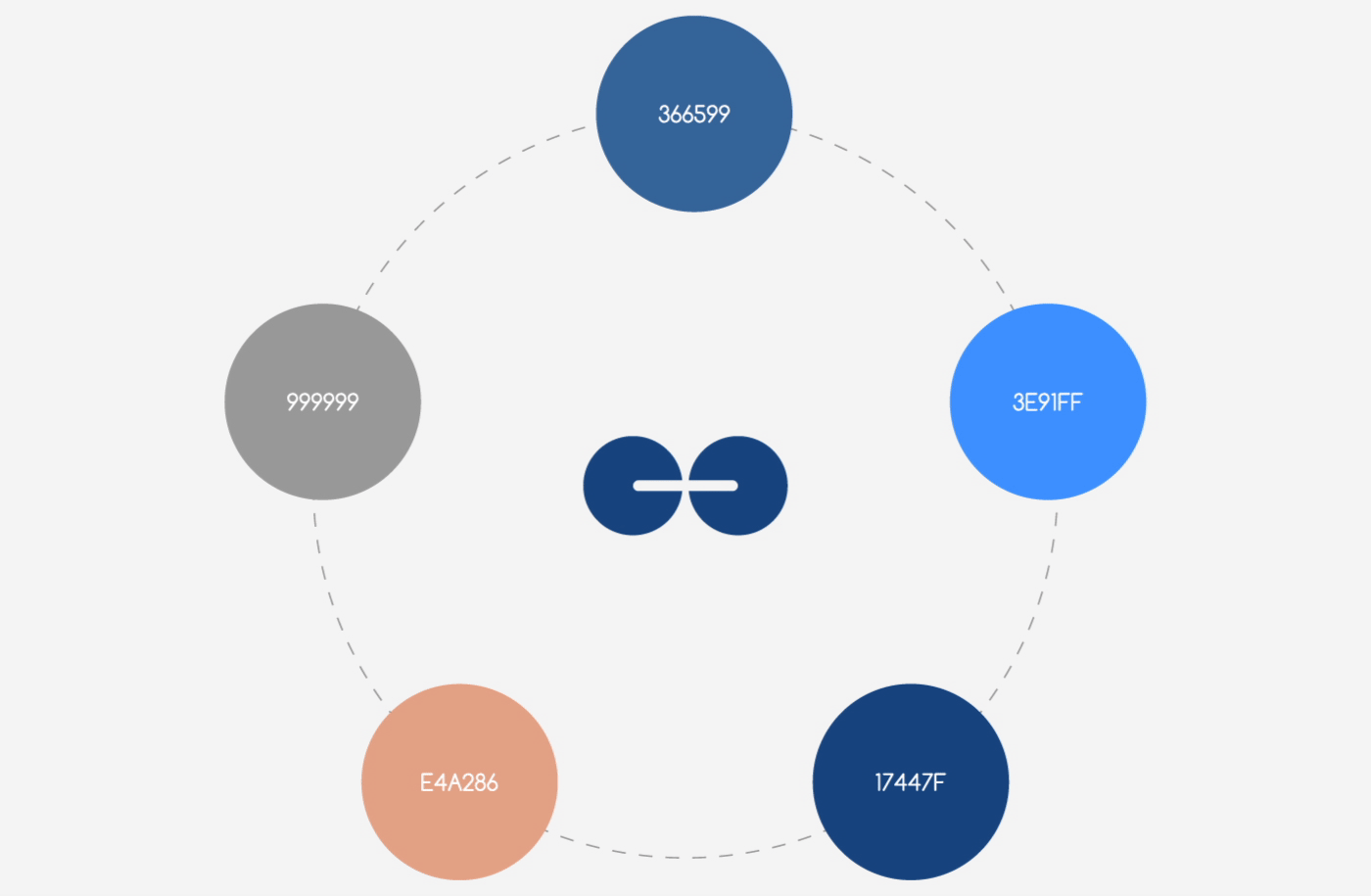
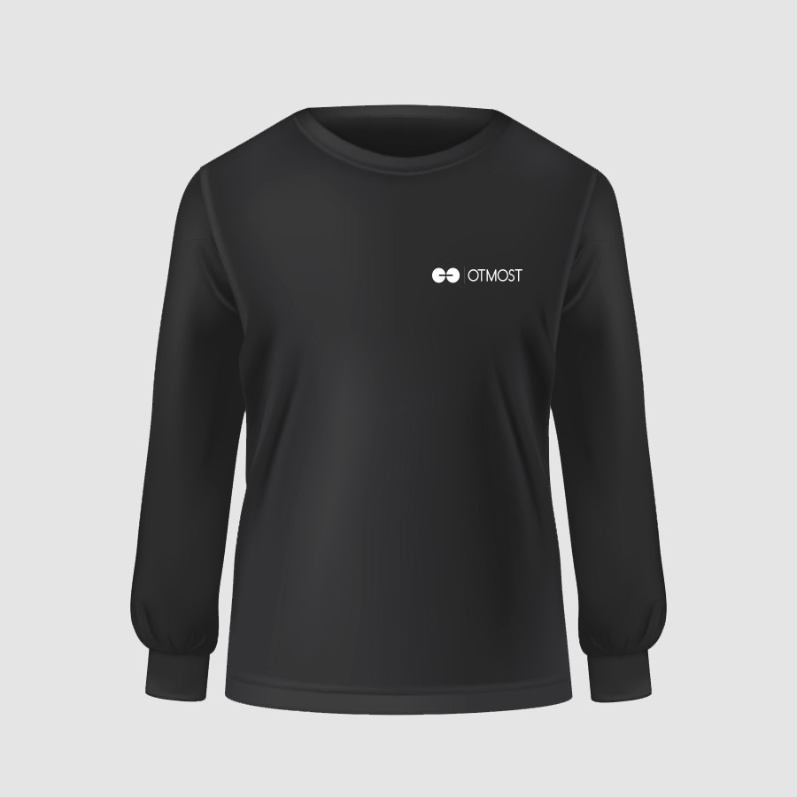
We chose blue, copper color and grey as the brand's colors to represent formality and professionalism on the one hand and innovation and difference on the other.

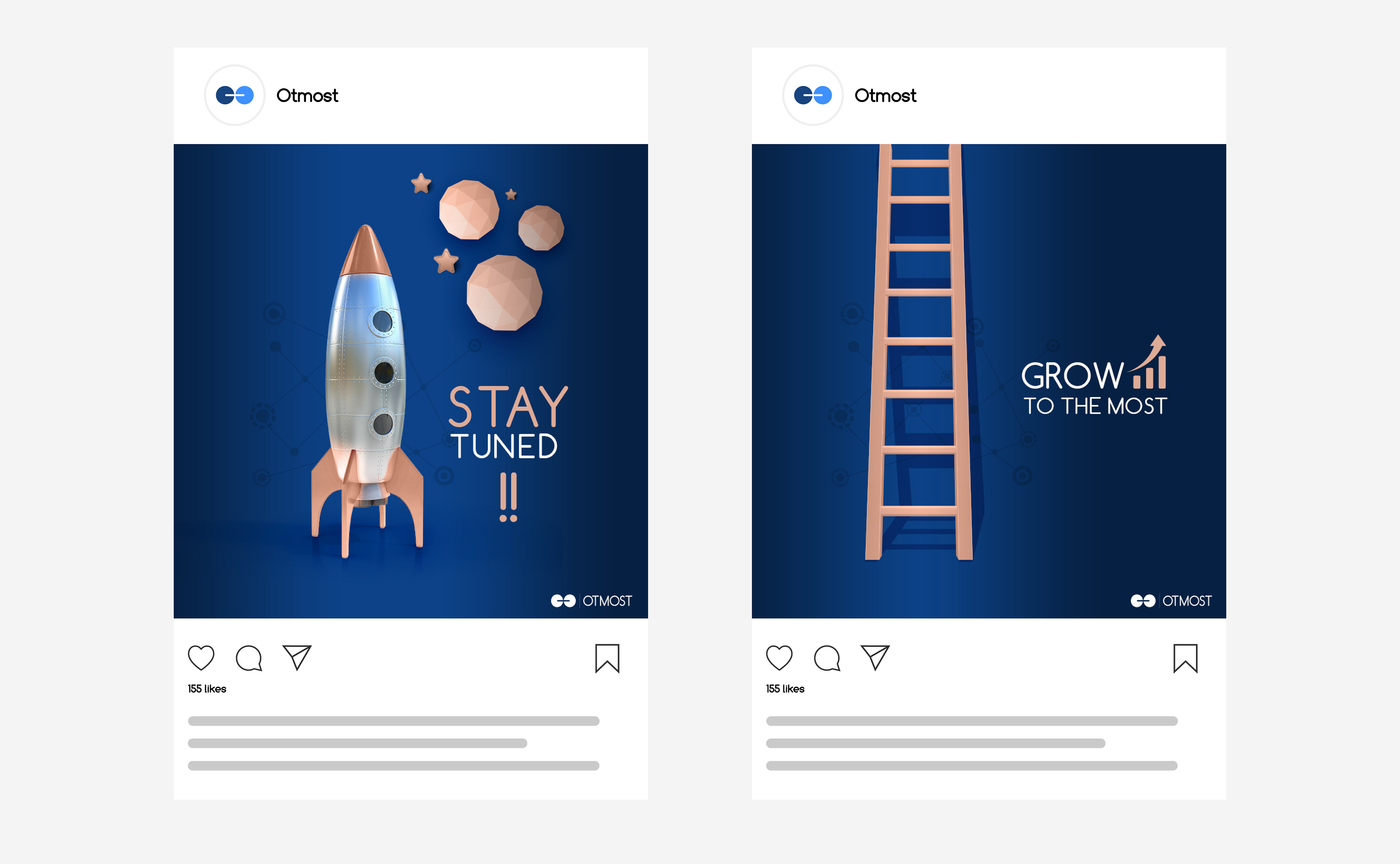
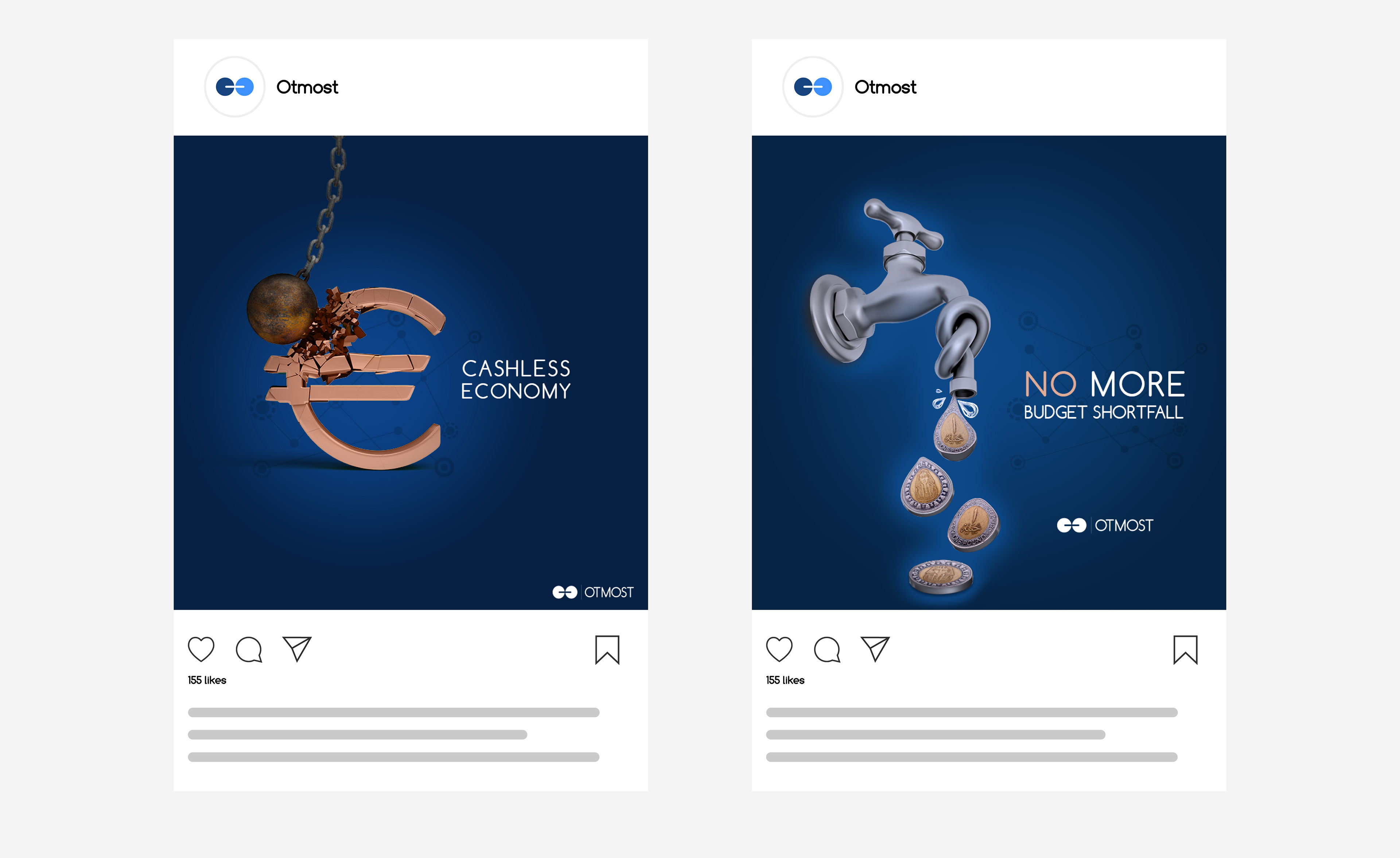
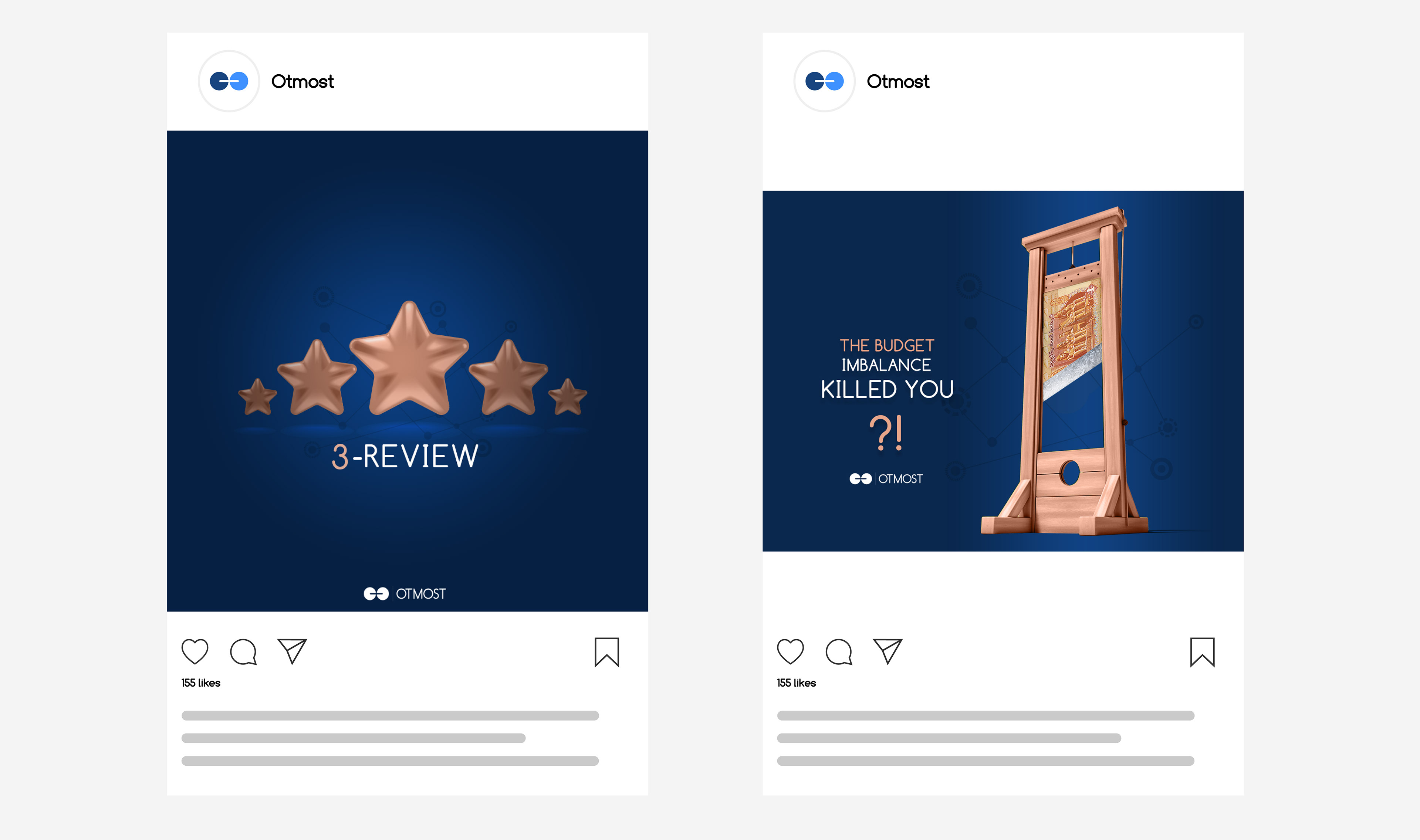
Social Media Designs are dominated by the space environment, with no human element, to symbolize the concept of the platform and digital communication.
3D elements are used in designs to represent innovation and uniqueness. And eye-catching lighting draws attention to the design objective.