LocHere
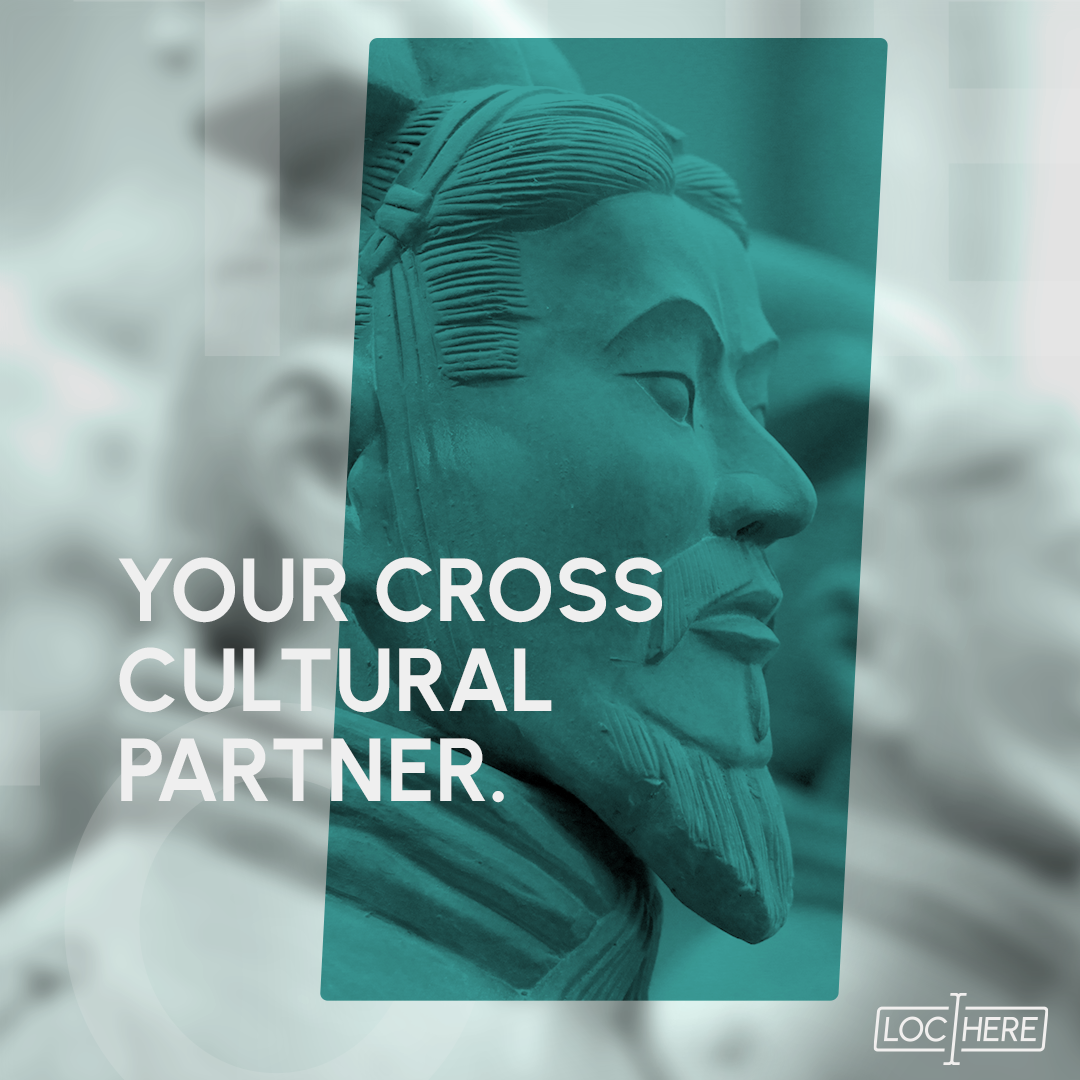
LocHere is a certified localization & translation agency that helps businesses to create not only localized words but appropriate and culture-fit messages and experiences.
They approached us to create a Full Branding and Website.
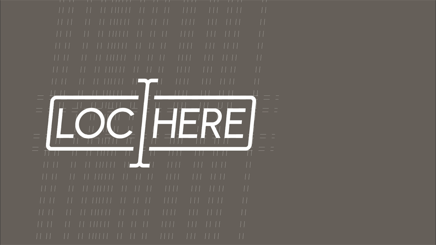
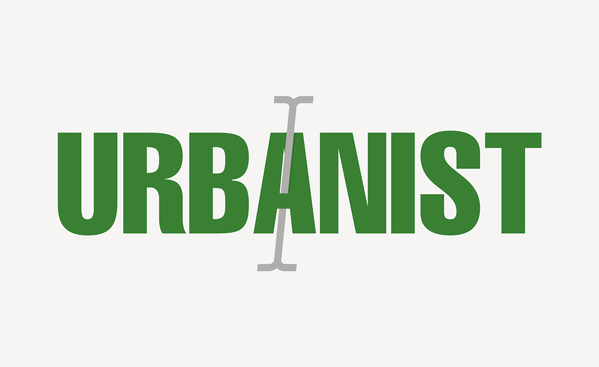
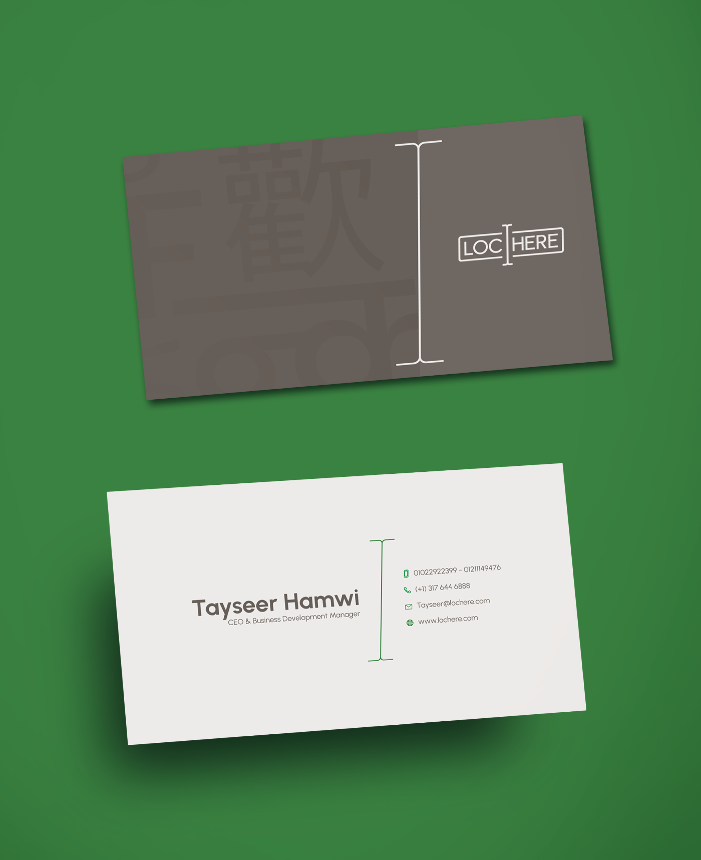
LocHere Logo
Text Icon & Paragraph Box:
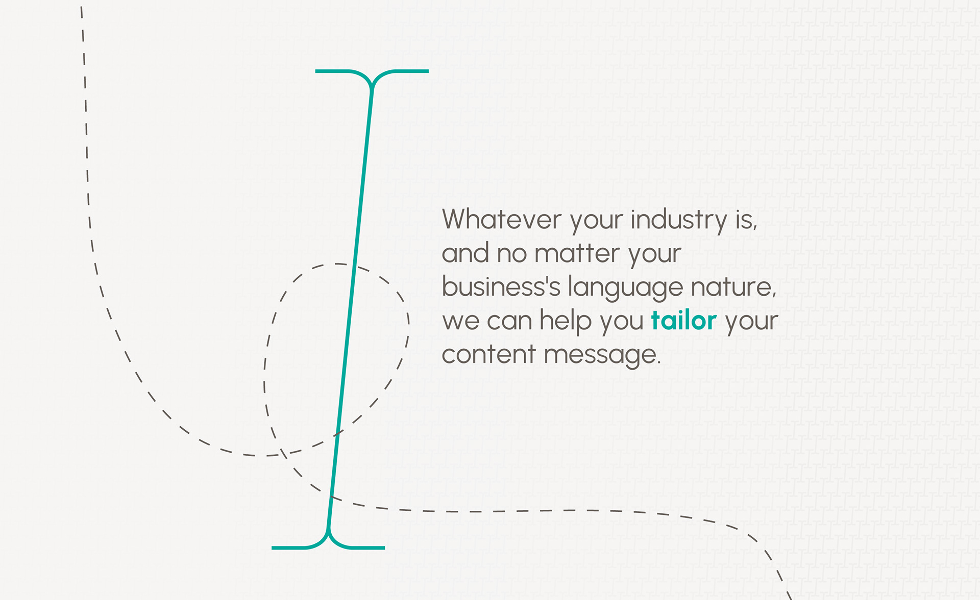
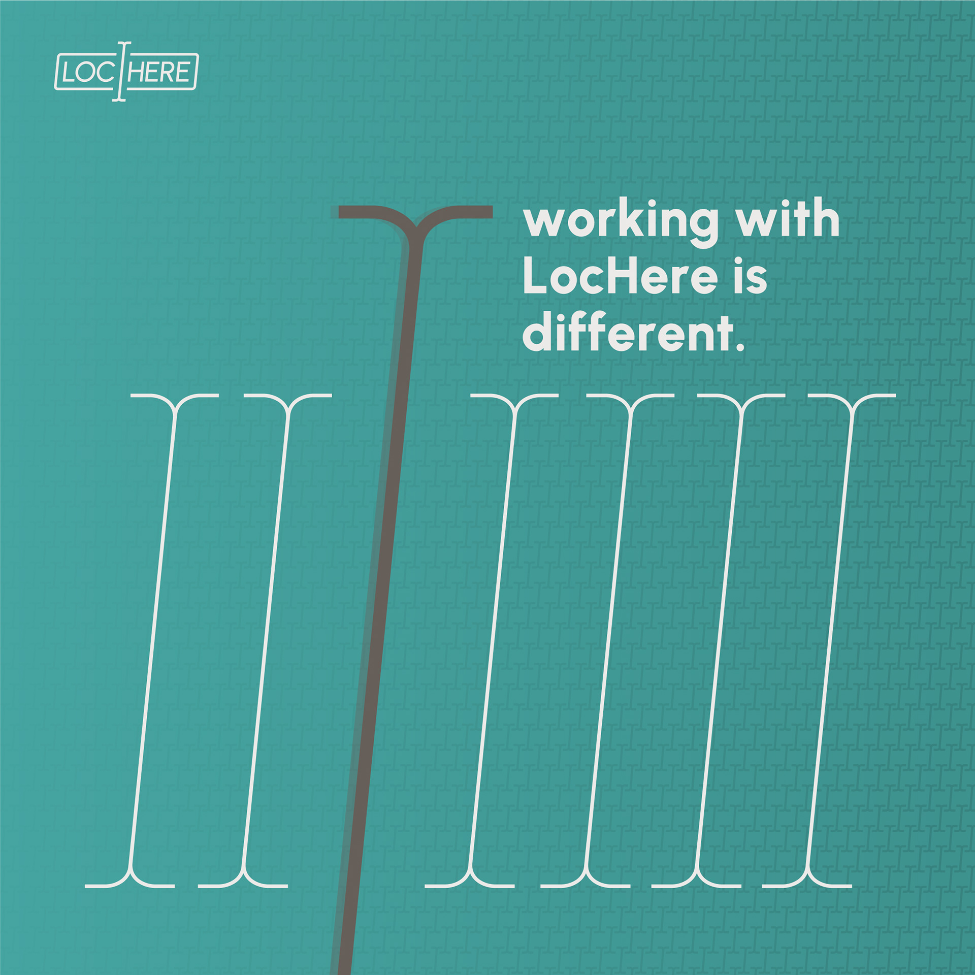
The core concept of the logo is a text icon that divides the writing box into two sections, symbolizing translation. By default, this icon remains in constant motion, reflecting Lochere's dynamism, flexibility, and speed.
Edges Reflection:
The logo's slanted shape reflects the service's speed and efficiency, while the sharp lines convey professionalism. The rounded corners of the writing box symbolize flexibility.
The logo's slanted shape reflects the service's speed and efficiency, while the sharp lines convey professionalism. The rounded corners of the writing box symbolize flexibility.
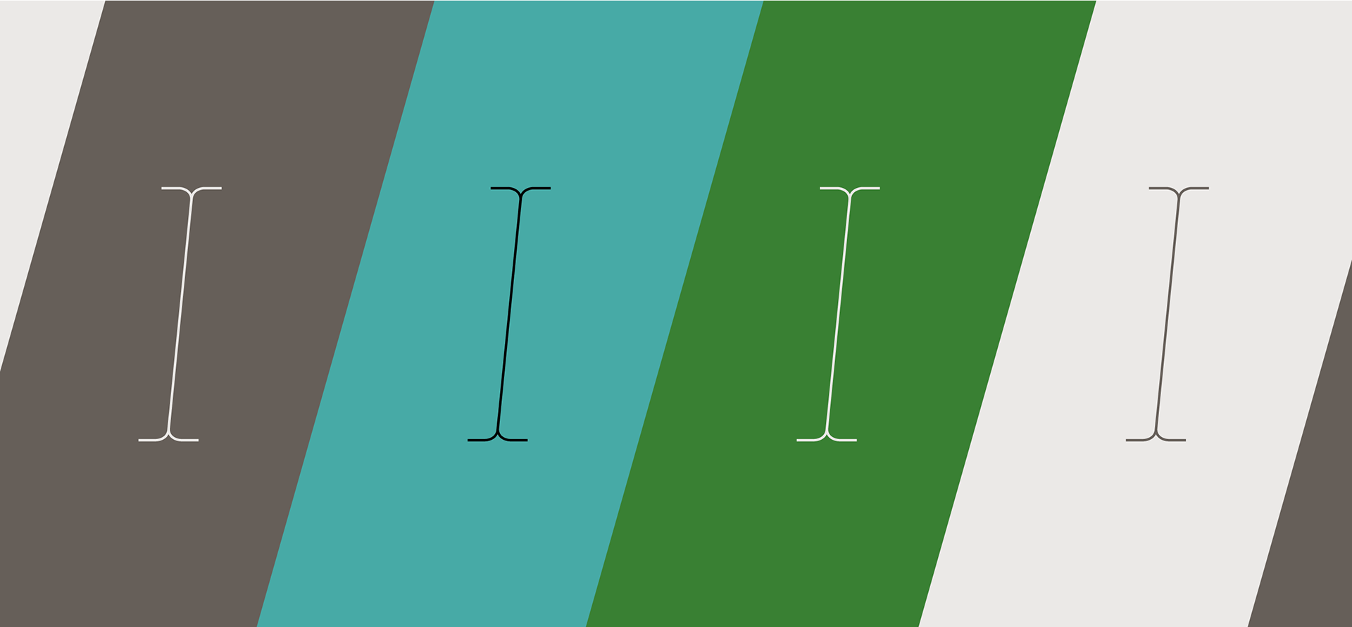


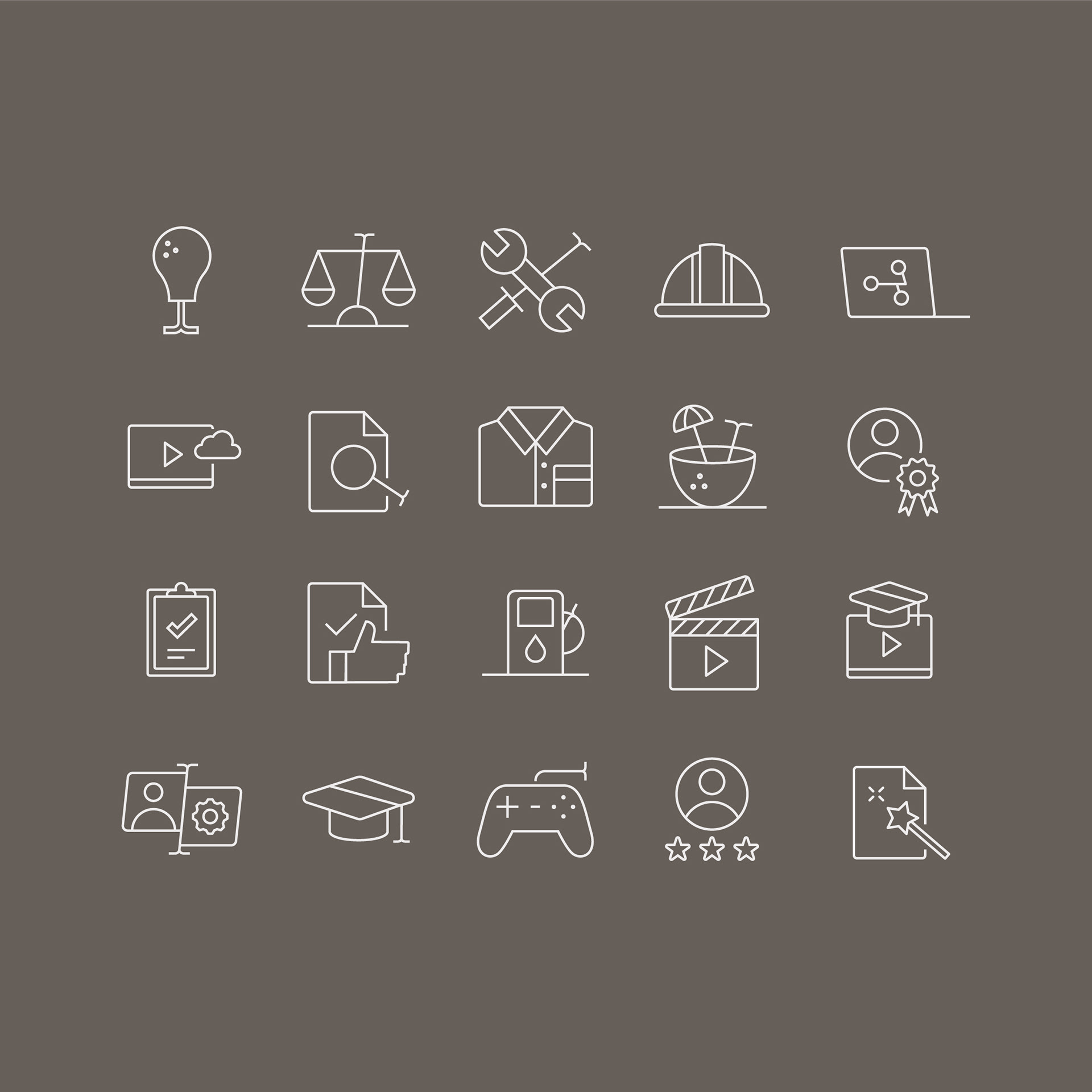
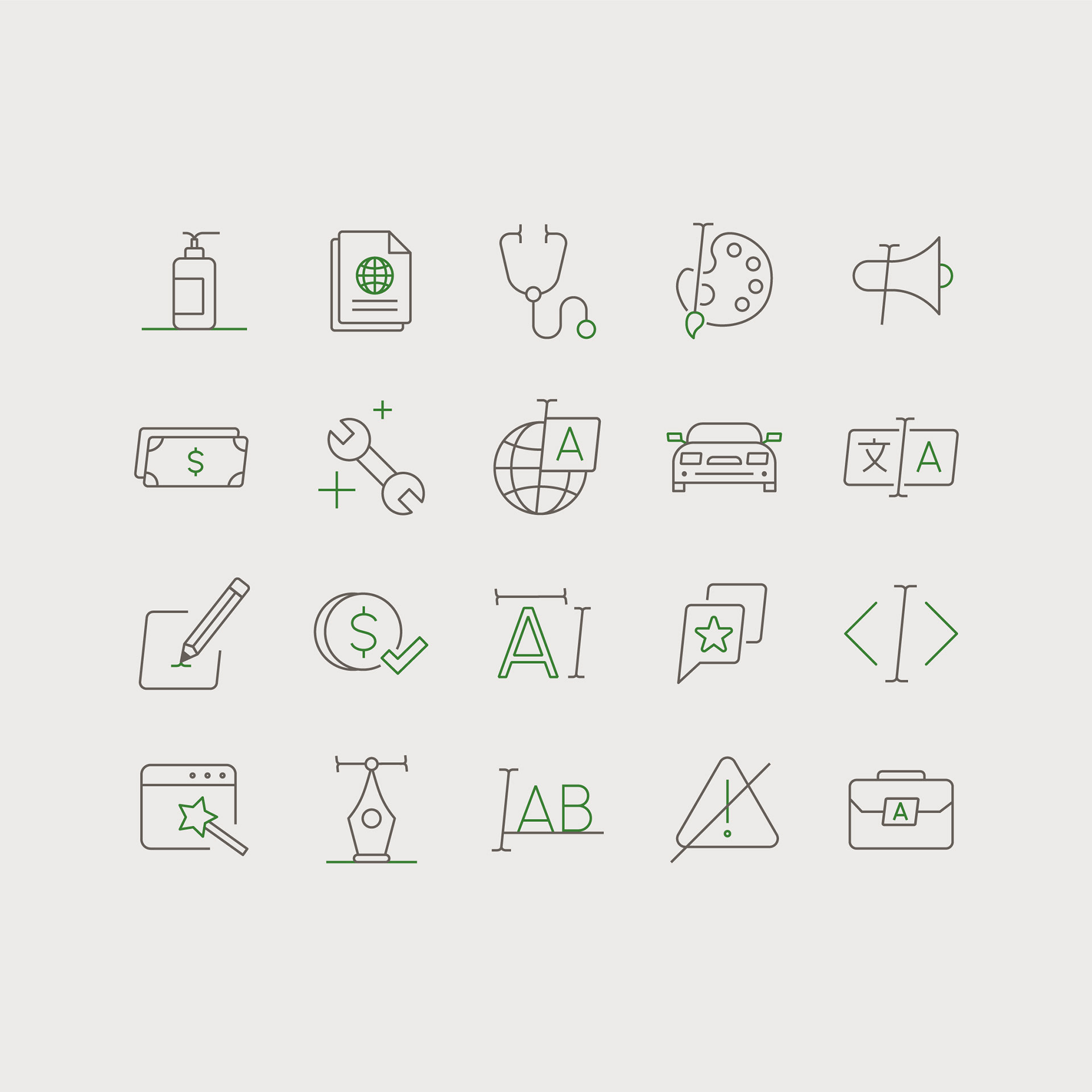
Icon System
As we care about every small detail, brand icons were no exception!
To ensure consistency, the shapes are designed from the core of the logo, with the text icon included in most of the icons. Furthermore, we used smooth geometric shapes—neither too friendly nor too firm.
To ensure consistency, the shapes are designed from the core of the logo, with the text icon included in most of the icons. Furthermore, we used smooth geometric shapes—neither too friendly nor too firm.

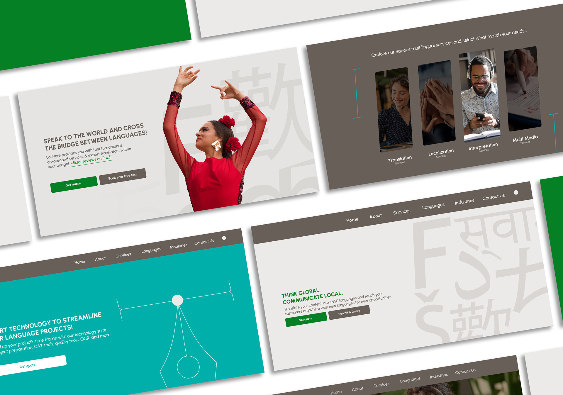
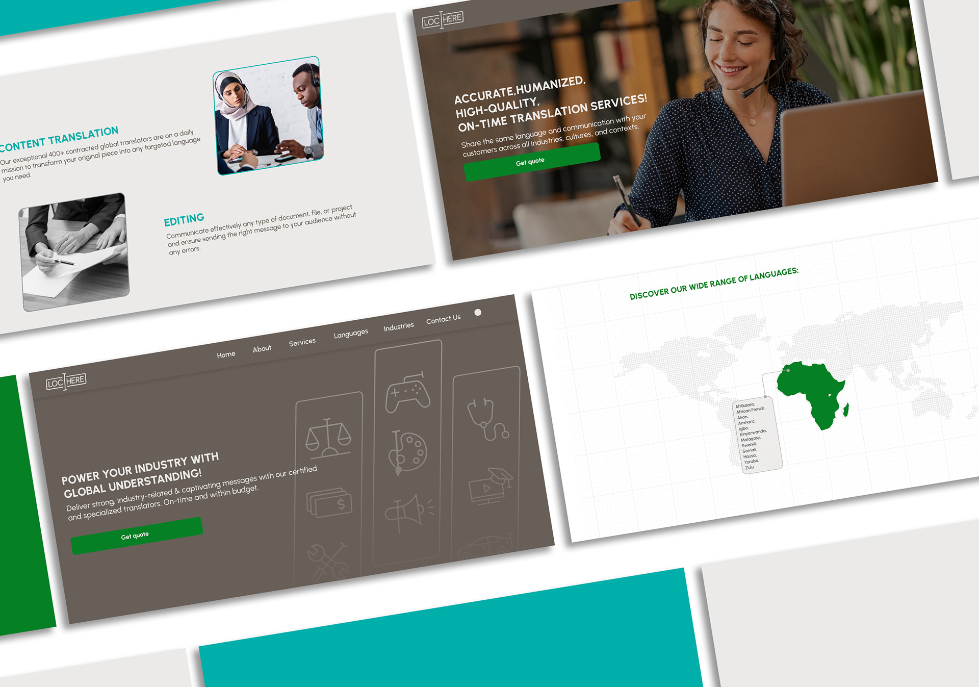
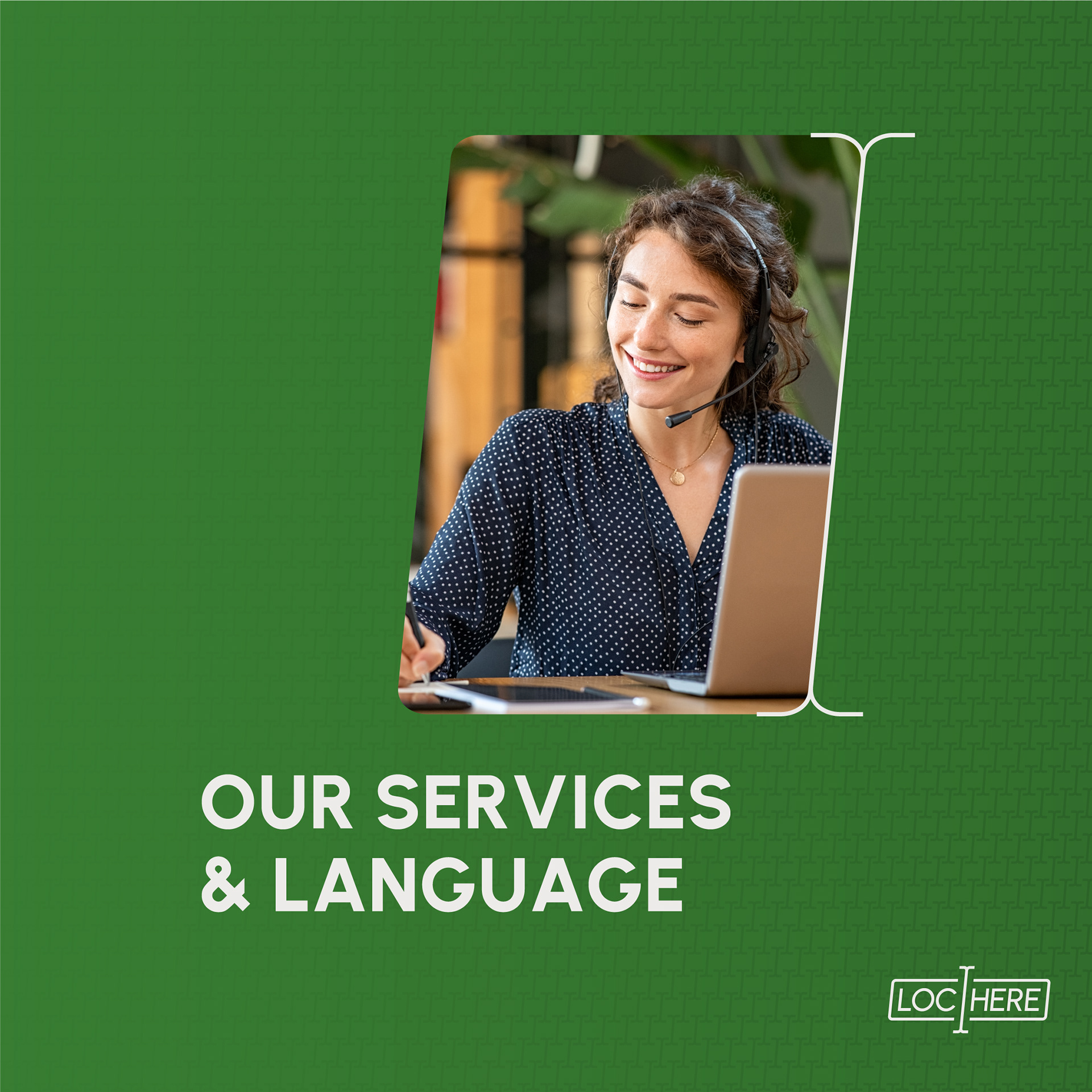
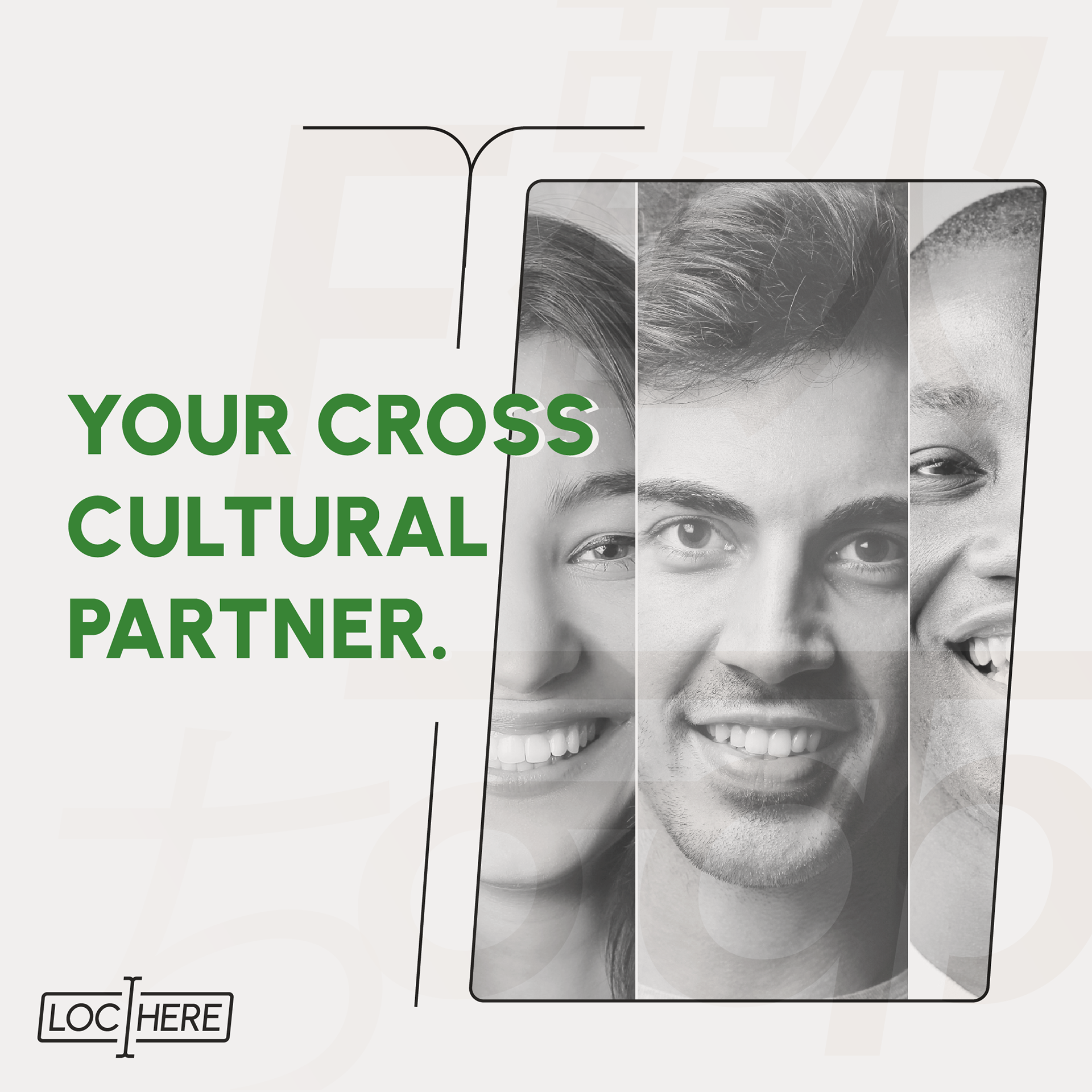
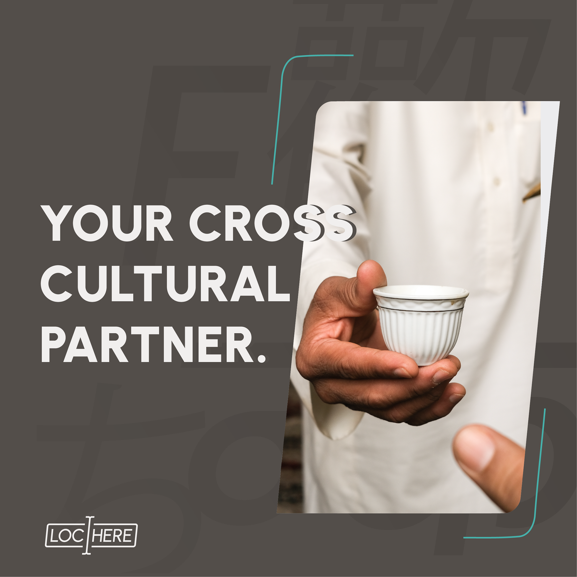
LocHere Website
After completing the branding, we began creating the full website, focusing on three key aspects:
1) LocHere bridges the gap between cultures, and the website reflects this cultural diversity.
2) As dynamism is a core value at LocHere, we designed the website to be fully dynamic and interactive.
3) We presented LocHere's complex services in a simple way, making them accessible and easy to understand.